Moving can be a fresh start. For a business, it’s an opportunity to form relationships with a new community, build on prior success with a new and improved space, or just get a little change of scenery.
For Annika DiMeo, chief of staff for Brand+Aid, it was a chance to work with a restaurant that wanted to refresh its brand identity while still paying homage to its previous location by developing some of the restaurant’s characteristics into a new logo and design aesthetic.
The whole thing didn’t go as smoothly as planned, though. Some artwork and printing issues, coupled with a frustrating turnaround time, made things difficult.
But, it proved to be a learning opportunity for Brand+Aid, and the client was happy in the end. So happy, in fact, that they’ve come back to the distributor for more orders over the past year.
Continue reading this installment of Decoration Diaries to learn more about how Brand+Aid overcame design issues, printing errors and turnaround times to bring a restaurant’s new identity to life.
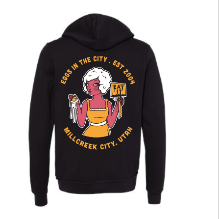
The client’s need: A local client was moving into a new building from a location she had been for many years. She wanted to refresh her brand while giving the nod to her original space. We came up with the idea of incorporating some of the iconic artwork she had on her old building walls and turning that artwork into a logo.

The execution: The client provided the artwork in vector format (with the artist’s approval, of course), and we offered a variety of mockups for the concept. Additionally, we presented and sent a variety of T-shirt samples, so she and her staff could select the ones they liked best before committing to bulk purchase.
We realized the original artwork had 10 colors, including the underlay! Our designer trimmed it down to 6 colors without compromising the art, and we were ablate move forward with production for these to be screen printed.
The obstacles: She received her first round of black T-shirts, and the decorator did not provide an underlay. The yellow looked green, and the artwork didn’t pop. We returned them for reprint and had to wait another two-to-three weeks.
The outcome & advice: We were able to rectify the situation by replacing the shirts. Our client was happy with the reprint, and has since reordered three times in the past year.
We commit to our word and willingness to provide our clients the best mercy. When mistakes happen, they are often the best way to learn. We now make sure we educate our clients on the decoration process. We always include options for underlay when putting together our sales orders and when we receive art proofs.


