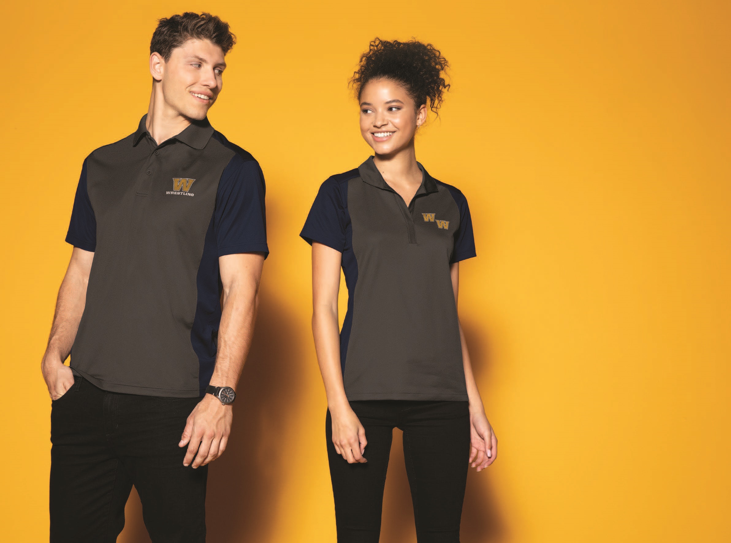
We’re constantly trying to find new and innovative ways to turn workout apparel into work-appropriate everyday wear. There’s still that one staggering question of “how do we get away with wearing a brand that is so commonly known for being one of the largest athletic/athleisure apparel companies?” Actually, the answer is quite simple, and Lululemon figured it out. It’s all about a new way the apparel company is using its logo.
Lululemon Athletica is recognized as one of the top companies in athleisure and workout apparel. In recent years, it has transformed and expanded its apparel lines to meet the office requirements of “business casual,” in the process giving other apparel retailers like Nike and Under Armour a run for their money.
So, what is Lululemon doing with its logo, exactly? Well, for some styles, the company is placing it in a discreet way—small enough to not overpower the pant, but big enough to still recognize the brand. At first glance, you might even recognize it.
First, the standard placement:
https://www.instagram.com/p/Bi-kq0cl50b/?hl=en&taken-by=lululemon
And now, the new:
https://www.instagram.com/p/BcbPm1ADLlK/?hl=en&taken-by=lululemon
On its athletic apparel, the logo is prominently displayed. But on its more dressed-up pieces, such as the women’s City Trek Trouser or the men’s Commission Pant Slim Warpstreme, the logo blends into the mid-calf point on the pant. Someone (your boss) might normally call you out for wearing the same leggings you wore for Vinyasa yoga this morning. Not so much with the new logo treatment.
What can we learn from Lululemon’s logo placement experiment? With the new placement and design, wearers no longer have to give up the comfort, feel and technical features they expect from Lululemon’s athleisure items. Instead, this is Lululemon’s ingenious plan to acquire new customers looking for office and everyday wear, while also keeping its current customers happy.
Promo distributors may feel as though the logo lacks in appearance, but this logo treatment lets end-users (we all know a few Lululemon addicts) show their dedication to the company and brand. By creating and designing the logo to be discreet and blend into the clothing line, it gives it that active, yet “professional enough for work,” stamp of approval. That means more opportunities for wearers to rock the clothes, which in turn could lead to higher brand loyalty.
That’s a win for everyone.


