PRINTING United Expo might appeal to printers from all over the world, but if there’s one thing we’ve highlighted with our coverage is how the convergence of print and promotional products was fully on display in Atlanta.
Speaking of displays, every trade show is sort of a promotional products show if you think about it. Each booth or hub needs to use things like signage and other products to draw in eyes, entice passersby to stop and check things out, and maybe leave with a physical item to remember who gave it to them.
With that in mind, we scoured the (seriously huge) show floor at PRINTING United Expo to see how exhibitors in both the print, apparel, and promotional products space got creative with their trade show setup.
Bonus: Be sure to continue to the end to see a few apparel decoration trends we picked up, too!
Make a Game of It
Trade show attendees love free promos, but it’s even sweeter when it comes with a challenge. That way they feel like they’ve really earned it, and are maybe even more likely to hold onto the product since it serves as something of a trophy.
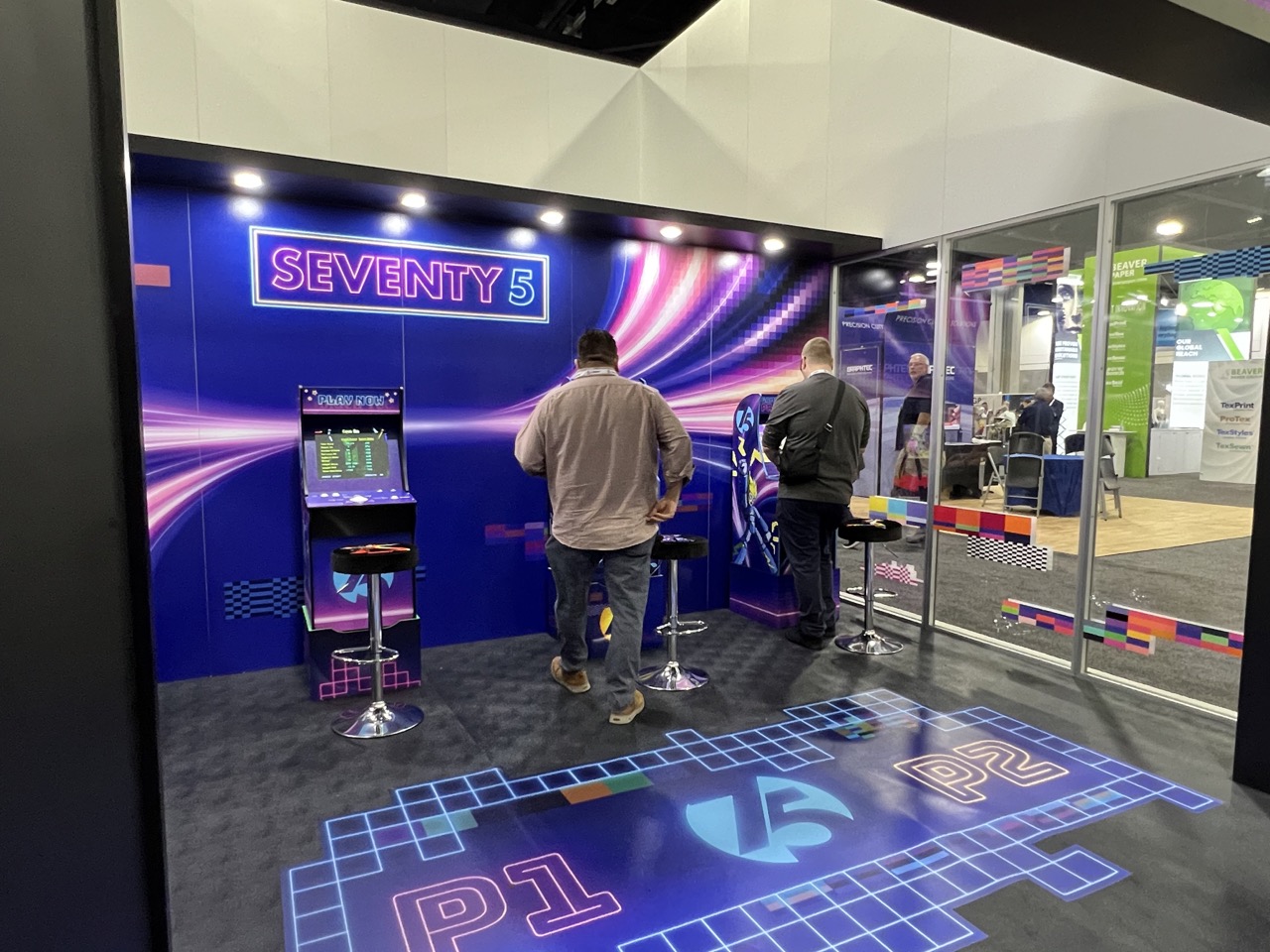
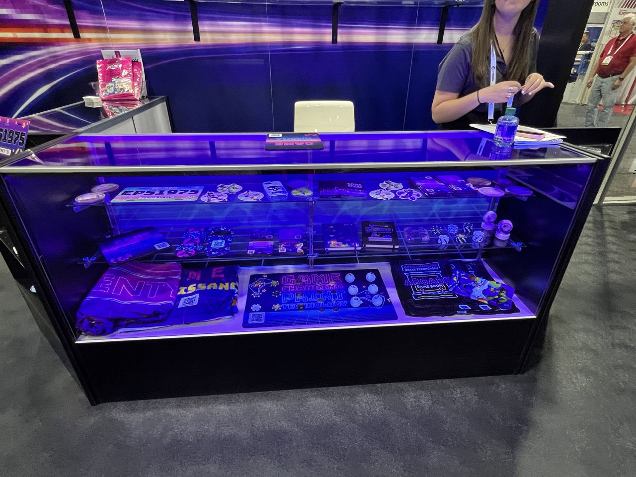
One booth turned its whole space into a retro-style arcade, where the giveaway products lived under a glass box the same way you might see classic arcade prizes like candy or parachute men. (Side note: Why aren’t there more branded parachute men as promos? Those things rock.)
This display all worked under the theme of “Changing the Game,” so the arcade motif made a lot of sense. It immediately caught your eye using the neon colors, and made you want to go in and check it all out.
Lights, Camera, Action!
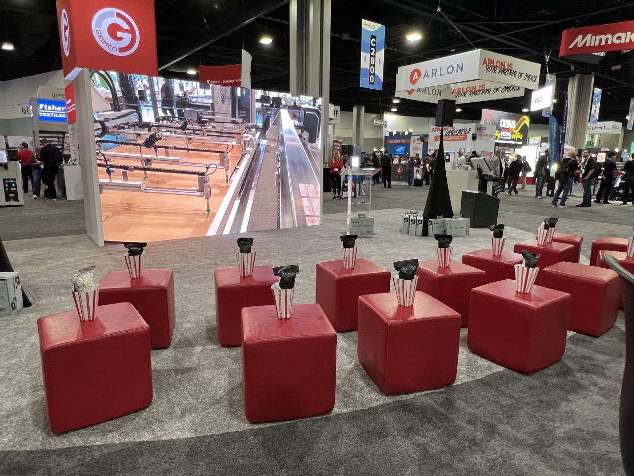
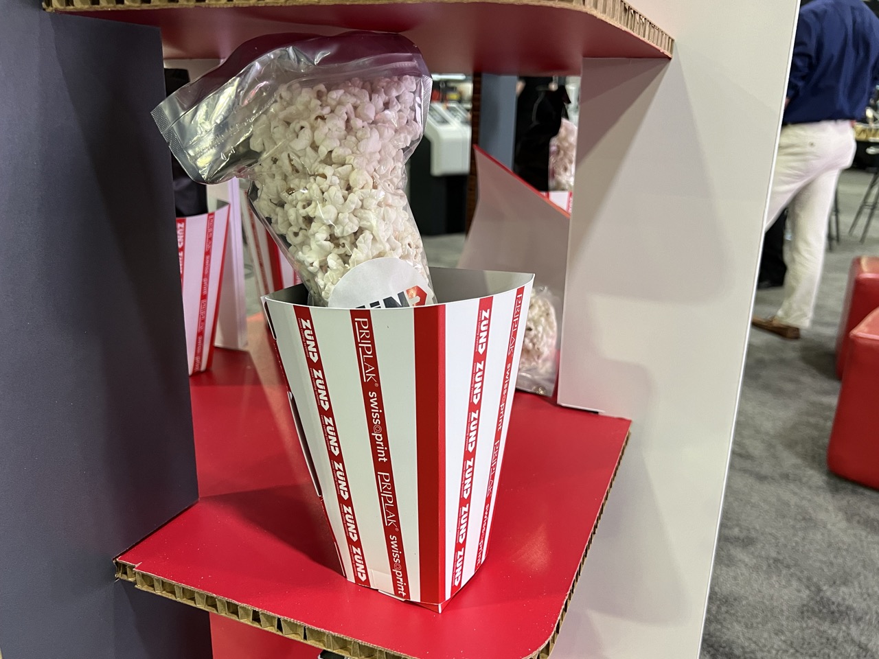
Some of the exhibits on the show floor included educational video sessions, where printers or decorators showed off some equipment capabilities to audiences. To make the whole thing a little more fun for the viewer, one exhibitor readied each seat with a branded kit full of popcorn and other goodies.
Incorporating a Logo
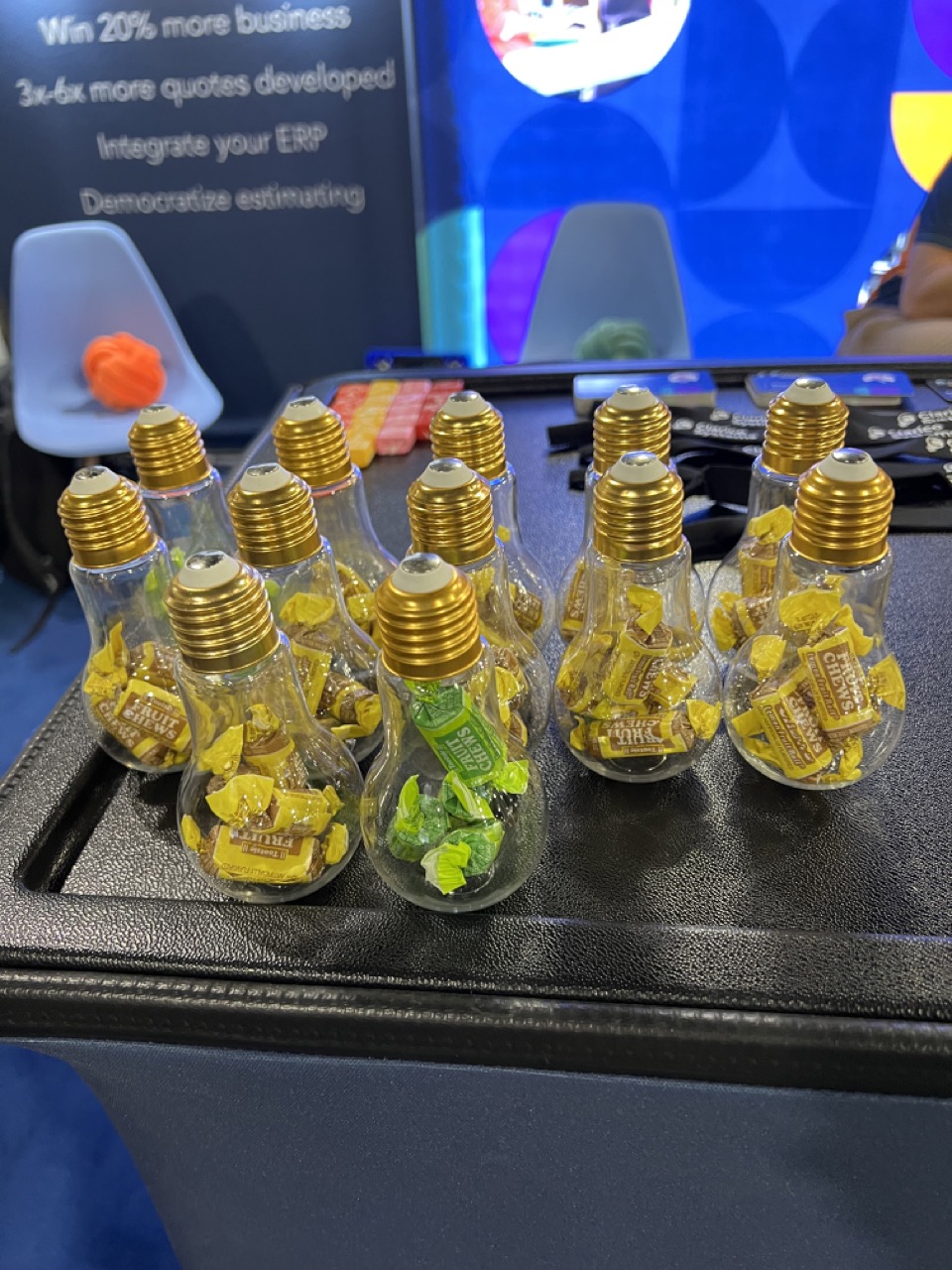
The standard practice of a promotional product is to take a logo and place it on the product. But, some logos can fully enter the physical space. When it’s a product that you can make the product itself, it adds a new dimension to the brand, like taking a company’s lightbulb logo and making candy containers shaped like lightbulbs for giveaways.
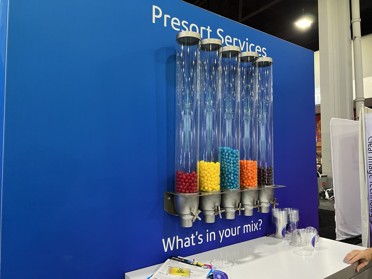
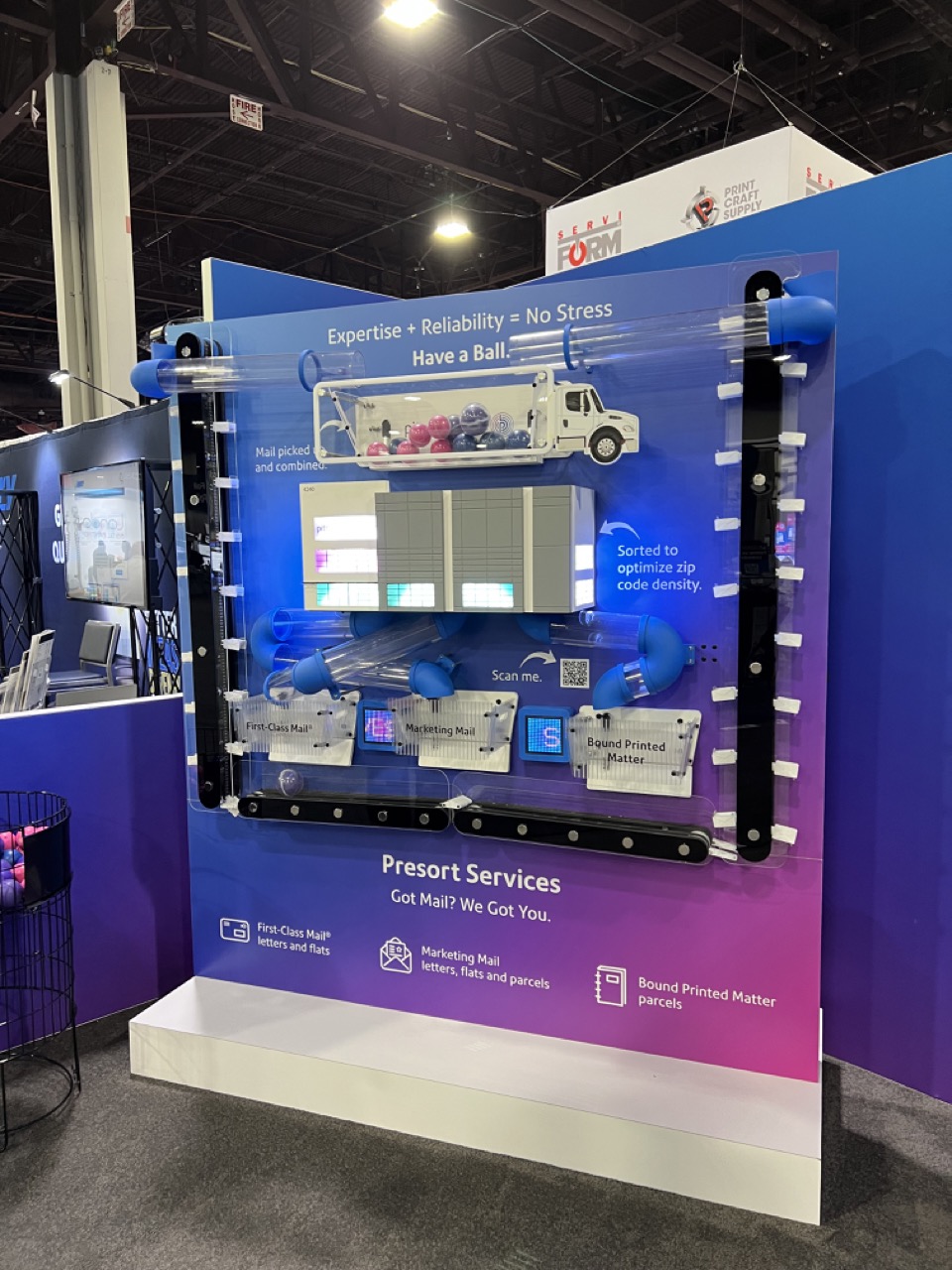
More than a logo, incorporating what the brand actually does into some interactive experience creates an even more memorable display. Let’s say your business handles sorting. What better way than to use color-coded candy dispensers and a little machine that “sorts” stress balls that use your brand aesthetic and colors?
A Little Color
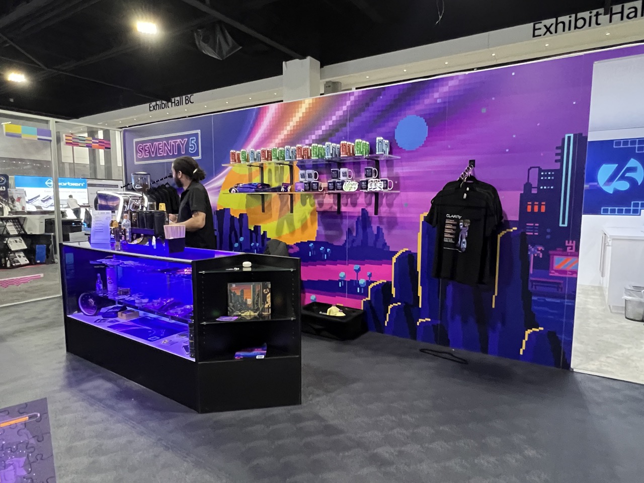
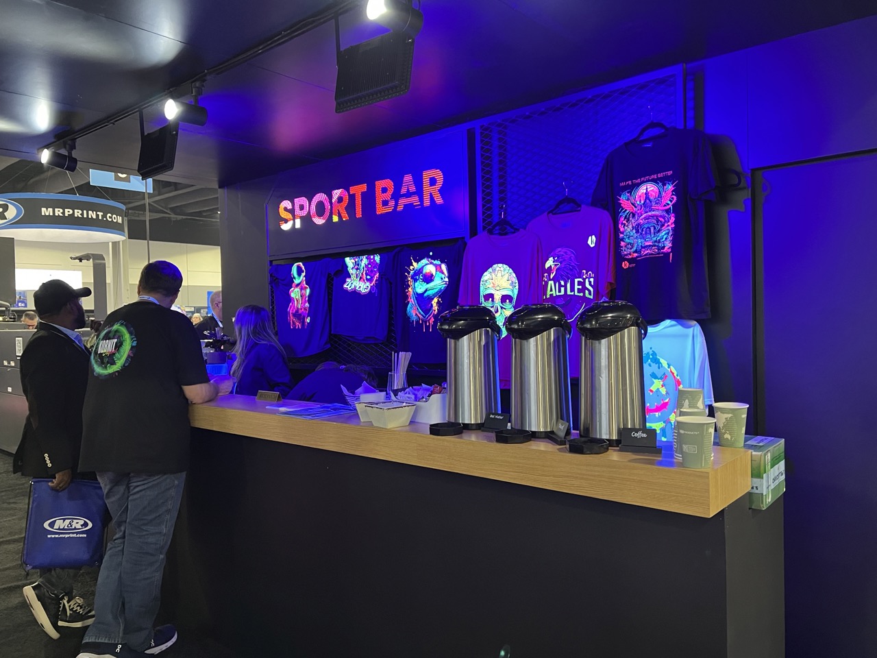
At the end of the day, human beings are just animals. Our lizard brains see interesting colors and are drawn to it. Using something like glowing blacklight colors or even just something beyond a typical and “safe” display color can be a smart choice.
There obviously still needs to be an artistic eye involved. You don’t want to just throw color at a display like you’re Jackson Pollock. A colorful swing, within reason, stands out from the rest of the trade show floor. This one created a bar-like scene, complete with stools and the ever-necessary coffee on the show floor.
Bonus: Small Apparel Trends we noticed.
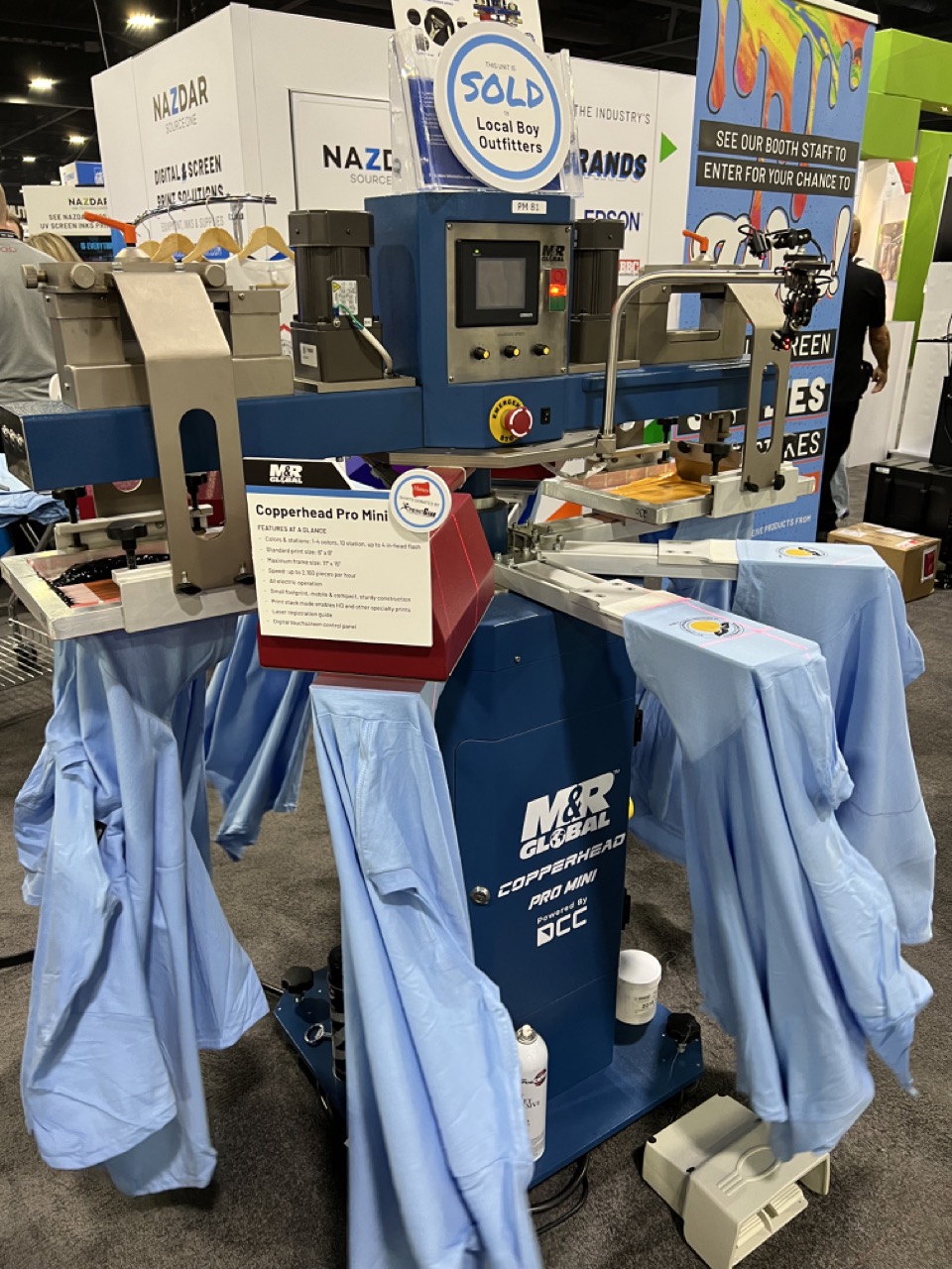
There will be plenty of apparel coverage from PRINTING United Expo from our sister publication, Apparelist, but we wanted to touch on some of the smaller apparel decoration details we noticed at the show. There were plenty of big machines for screen printing, embroidery, curing, etc., but when you looked a little longer, you noticed small details that distributors should take with them into the new year.
Sleeve Decoration
When you’re doing an apparel promotion, the first instinct might be to focus on the imprint on the front of the T-shirt. After all, that’s pretty much the most traditional way to do it, right? People also like a smaller front chest imprint with a larger back imprint, but what about the sleeves? Using a small aspect of the brand’s identity on the sleeve, like a minimal logo or a motto, is a nice touch that end-users will appreciate.
The 2000s Are Retro Now
I know. For those of us who vividly remember the early 2000s, all of these millennium looks coming back with the kids is making us feel old.
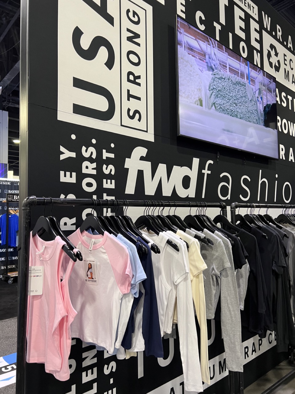
We’ve already seen things like baggier pants and T-shirts, but we noticed a lot of baby tees on the show floor. While it might be hard to admit, styles like this from the early 2000s are coming back. Speaking of backs, ours are starting to hurt…
You can view our full recaps of days one and two of the PRINTING United Expo in Atlanta.

