Burger King is completely overhauling its brand identity, with a new (throwback) logo, updated packaging and all-new uniforms for employees.
Despite the company calling its update a “more modern look,” the new logo will look familiar to most. It’s simple, minimal. And the packaging goes along with it.
Burger King unveils its first major rebrand in 20 years: https://t.co/8URzwX1v8h pic.twitter.com/UT0R5ye5sK
— Co.Design (@FastCoDesign) January 7, 2021
Remember, this is the same company that just introduced more eco-friendly packaging options, with the promise of reusable packaging becoming a more common practice in Burger Kings all over the world. The new packaging has a raw, natural paper look to it. Even though it’s all still single-use, it looks like the kind of thing that is less processed and more readily-recycled.
While we still wait for reusable packaging for sandwich items, the rebrand includes a fun design on the top of each packaging component, giving individualized branding to every menu item.
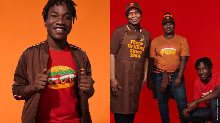
And finally, the company is giving its employees a new look:

Fast food companies, and other businesses that rely on uniforms for their employees, are increasingly deviating from the more stuffy and, well, uniform looks in favor of customization options and the opportunity for some actual outfit-building. A lot of them are doing it through company stores, offering employees branded products that still work within the uniform guidelines but allow for individual expression.
McDonald’s did this a few years ago with different fit and style options like T-shirts and other pieces to put together a whole branded look without relying on the same thing for everyone.
This seems to be the future for uniforms, as it still creates a unified brand experience and professional look, but appeals to the changing sensibilities of younger generations entering the workforce. It looks updated. Think about the Apple store or other personifications of the modern age of commerce.
According to Delish, Burger King’s new uniform options include T-shirts with cartoon-y renderings of burgers and fries; polo shirts and hats; and aprons that say “Flame Grilling Since 1954” in the sort of ‘70s font appropriate for the neo-retro overall vibe. There also appears to be an enamel pin set that will complement the uniforms, as seen in the promotional video below:
Burger King is a big company. It’s successful. It knows how to stay afloat and stay relevant. This is a good lesson for promotional distributors whose clients are looking to spice up their own branding and apparel options. Company stores and retail-inspired looks are going to dominate the workforce and provide the perception of modernity, even if the designs themselves are retro-inspired.
On the packaging side, until we go fully green as a society with reusable packaging, it’s clear that minimalist designs and materials are going to be the norm.
Overall, this is a good example of brand cohesion. From the new logo down to the smallest piece of packaging and even the digital presence. Above all, a successful brand is consistent.


