With Labor Day Weekend right around the corner, brands are starting to release their fall products. There are few companies with as much demand for branded products than Starbucks, which just released a new line of branded drinkware and gift cards for the season.
That isn’t huge news on its own. Every big-name fast food and fast-casual brand is going big on branded merchandise these days. But, the thing that Starbucks has that others don’t is an international community of people who buy up these branded products as collector’s items, re-sale products or just acting out of brand loyalty.
So, looking at the new line of Starbucks products is a good look into what customers will want in branded drinkware products this fall and beyond.
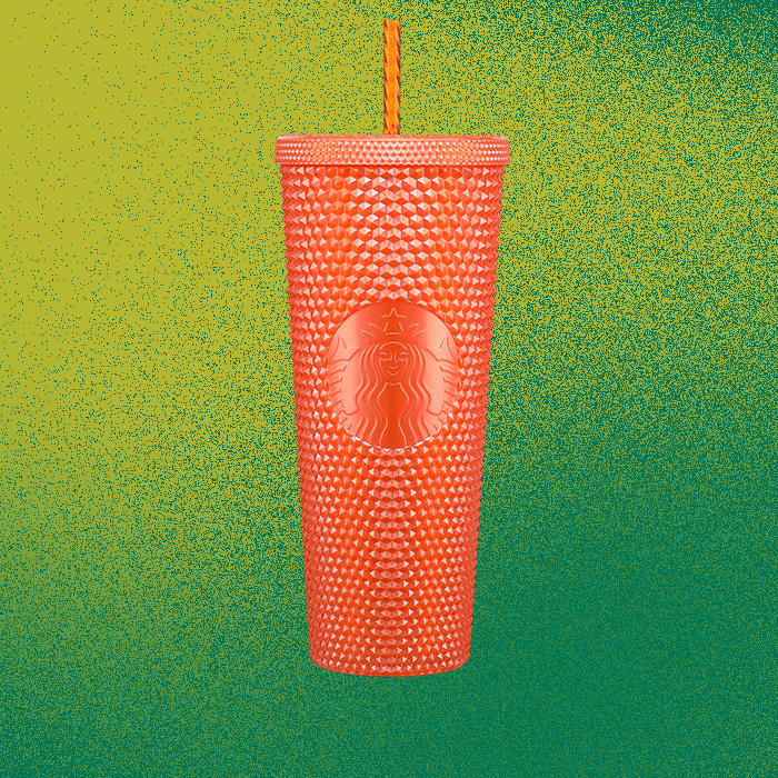
First off, there’s the Bling Cup: the shimmery branded tumbler that the internet went nuts for in previous seasons. This fall’s version is a very festive orange with the Starbucks logo built into the cup.
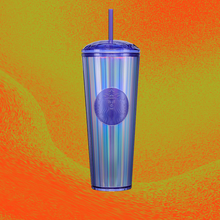
While we’re on the topic of shimmery tumblers, there’s also the “Kaleidoscope Cold Cup,” which features an iridescent purple color.
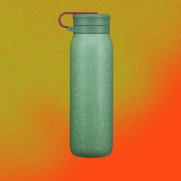
As for water bottles, the Textured Rainforest Water Bottle has that outdoorsy ruggedness with minimal branding and a very earthy shade of green.
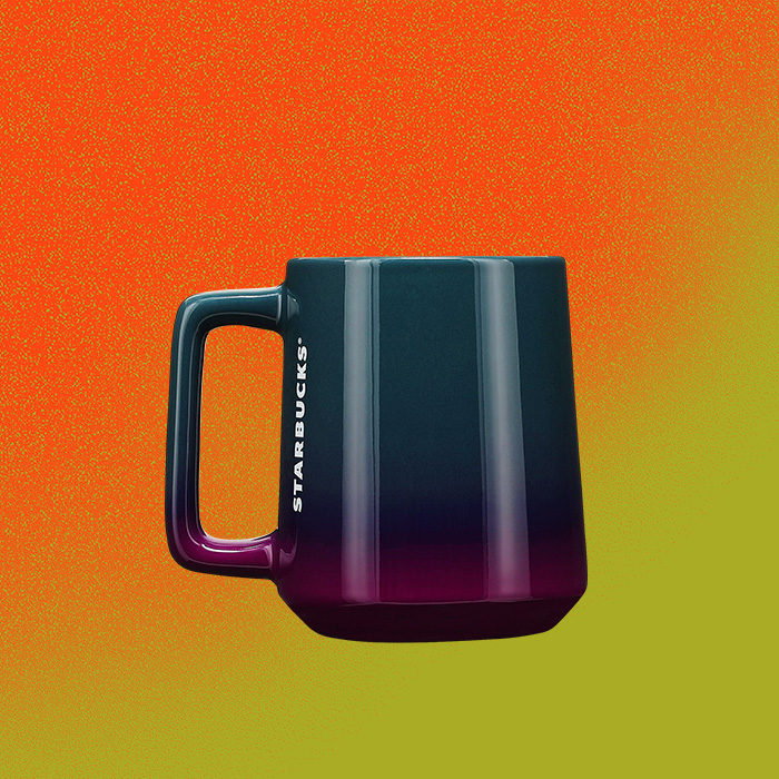
The Ocean Gradient Mug features a purple color scheme that fades from dark to light at the bottom, “like the first glimpse of sun on a crisp fall morning,” according to a press release. The branding placement is a subtle-yet-eye-catching white “Starbucks” in its classic font.
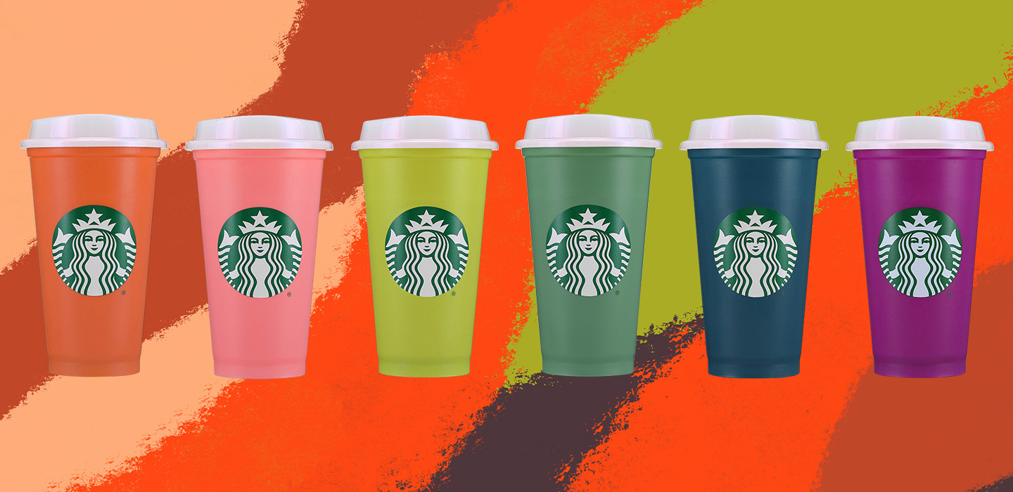
There’s also what seems like Starbucks fans are waiting for with every changing season: the classic Hot Cup. Rather than just the subdued harvest colors mostly associated with fall, Starbucks incorporated some bold and bright shades, like a pink, lime green and purple. There’s also a navy blue, forest green and orange.
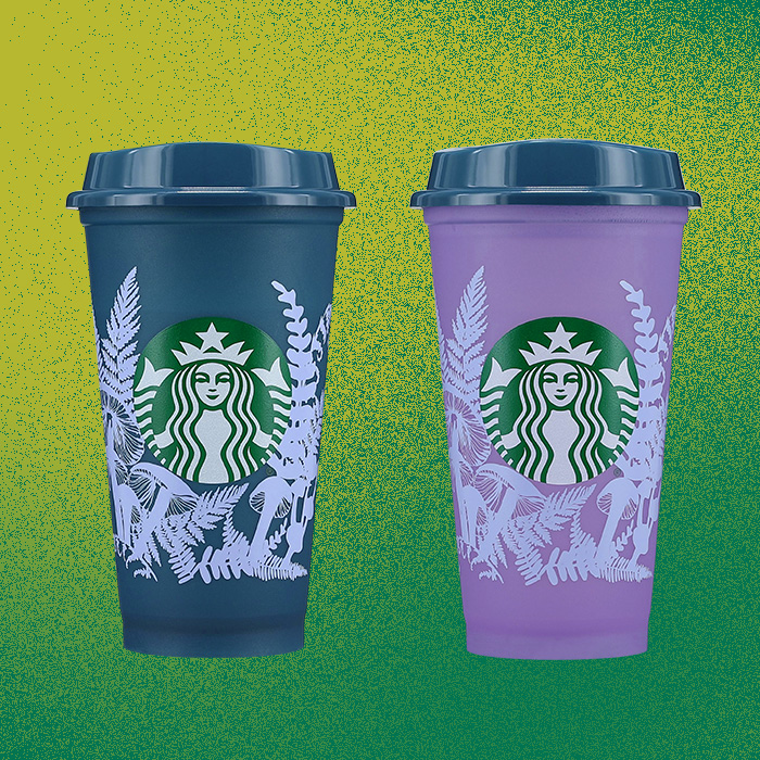
That brightness also features on a special edition of the Hot Cup, which changes color from a deep bluish purple to a bright lavender shade, along with a forest design surrounding the Starbucks logo.
The biggest takeaway, aside from the use of color during a season where other brands tend to tone things down, is the subtlety of the branding itself. The tumblers fully integrate the logo, eschewing the green-and-white color palette usually used for branding. It features on the hot cup, but the water bottle and the coffee mug opt for much more minimal logo placement.
It shows Starbucks is going for less of an in-your-face approach with its logo, and more of a “if you know, you know” vibe, especially with the popular tumblers. They don’t need to overwhelm customers with their branding, because just by looking at it, Starbucks people can tell it’s from Starbucks.
That minimal design choice is becoming more apparent in other sectors of the promotional products industry, like apparel, which we just saw on Chrysler’s new lifestyle line.
Going forward, you might consider a branded product where the logo isn’t front-and-center, but instead tastefully incorporated into the design of the product. Or, if it is featured prominently, opt for using different color choices to tone it down a little.
Also, it shows the importance of reusable drinkware. Starbucks has joined other restaurants in introducing programs that encourage reusable cups. That trend is only going to go up from here.


