Walking the floor at a promotional products trade show, it’s easy to get into a position where you don’t see the forest for the trees. You go from booth to booth looking at what each exhibitor is showing, maybe you have a quick conversation and get a free sample, and you move on.
But if you can zoom out just a little and slow down, you recognize that the booths themselves are examples of promotional displays. It’s unique to a promotional products trade show, where every single bit of the show is part of the promotional products world. The signage, the printed products, the inflatables, everything meant to draw you in to the booth itself is also part of it. It’s like the edible landscape in the Wonka chocolate factory.
Looking around the show floor at the PPAI Expo, we tried to notice some of the most interesting and enticing booth displays, with some insight into how distributors can use various promotional products to help their clients build their own booth experiences.
Think Green
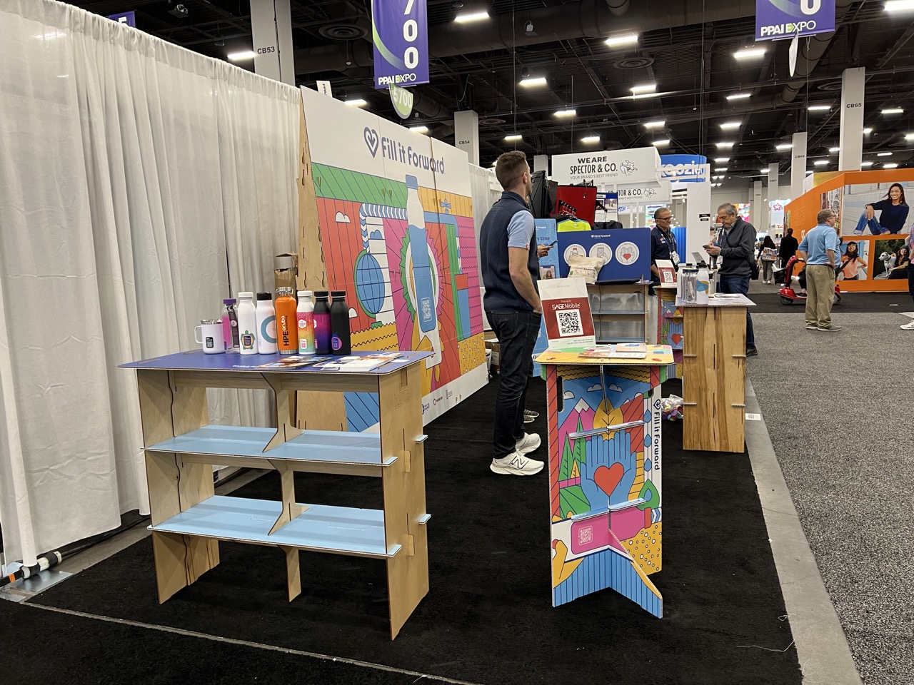
Fill It Forward went with an eco-friendly approach to its displays, using simple paper pieces for the tables and shelves, rather than plastic or even metal. If you or your clients want to get the message across that you care about environmentalism, every single detail needs to follow along with that.
Light It Up
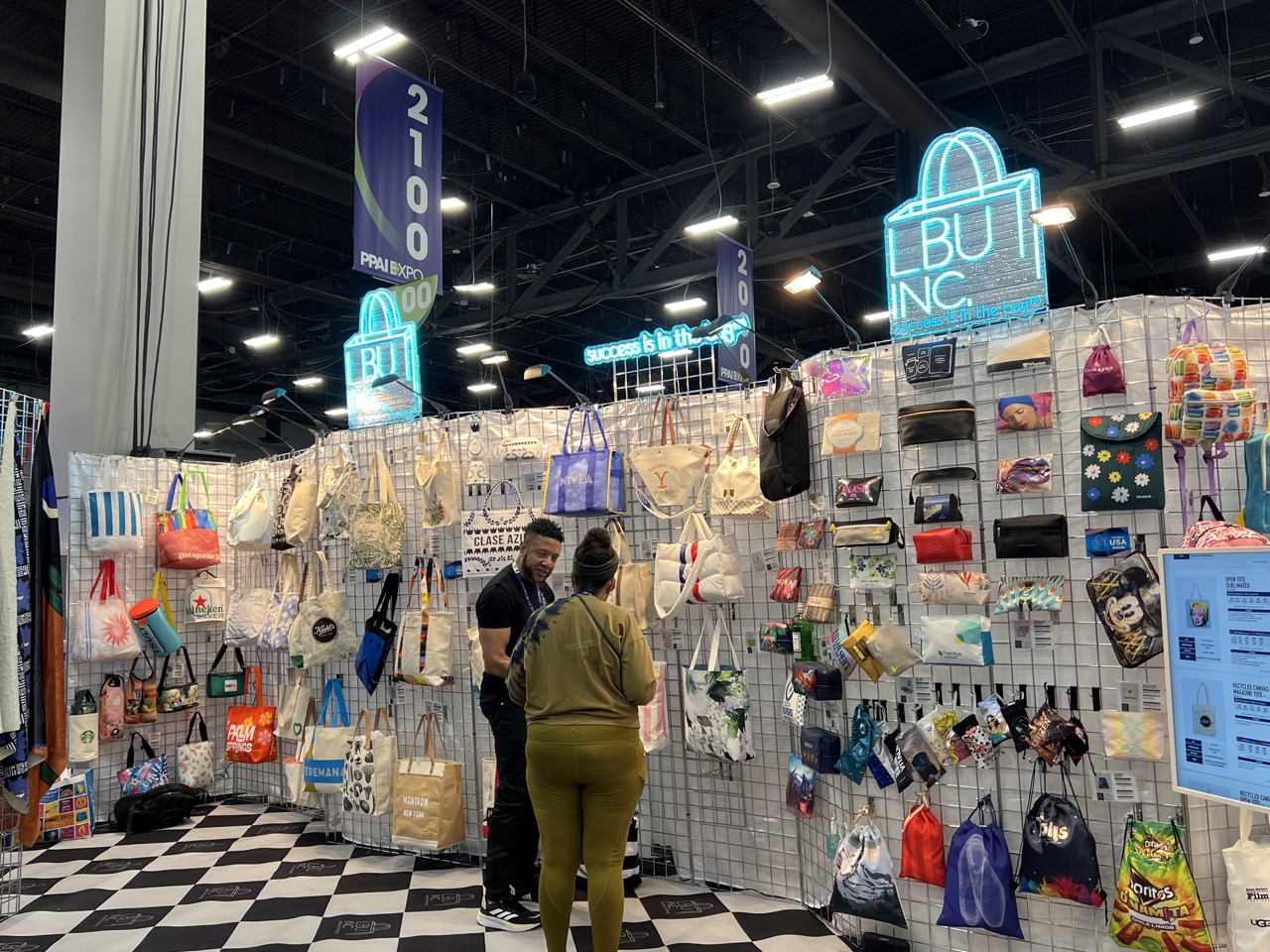
We’re all still animals at the end of the day, and nothing draws us in like a bright light. LBU Inc. used simple, but effective, neon lights with their logo to stand out against the backdrop of the show, and cut through the bright convention hall fluorescent lights, too.
Lean Into a Theme
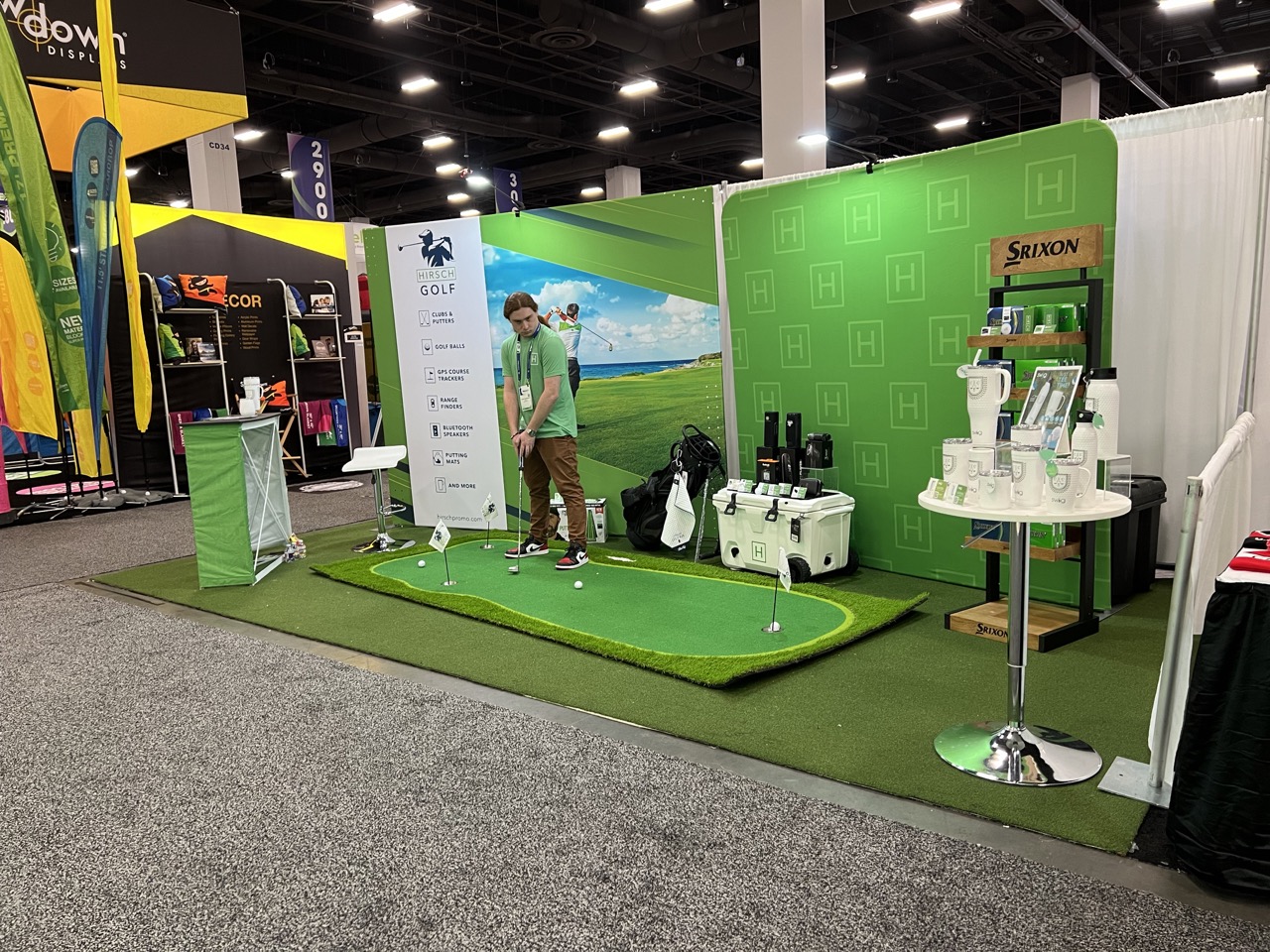
If you’re selling golf products, what better way to decorate your booth than with a golf theme? At Hirsch’s booth area, there was a separate area geared toward golf products like balls and more. Green already plays a role in Hirsch’s overall branding aesthetic, but the company decked the area out top-to-bottom to drive home the golf vibe (no pun intended). Also, what’s a golf display without a putting green?
Don’t Be Afraid of Color
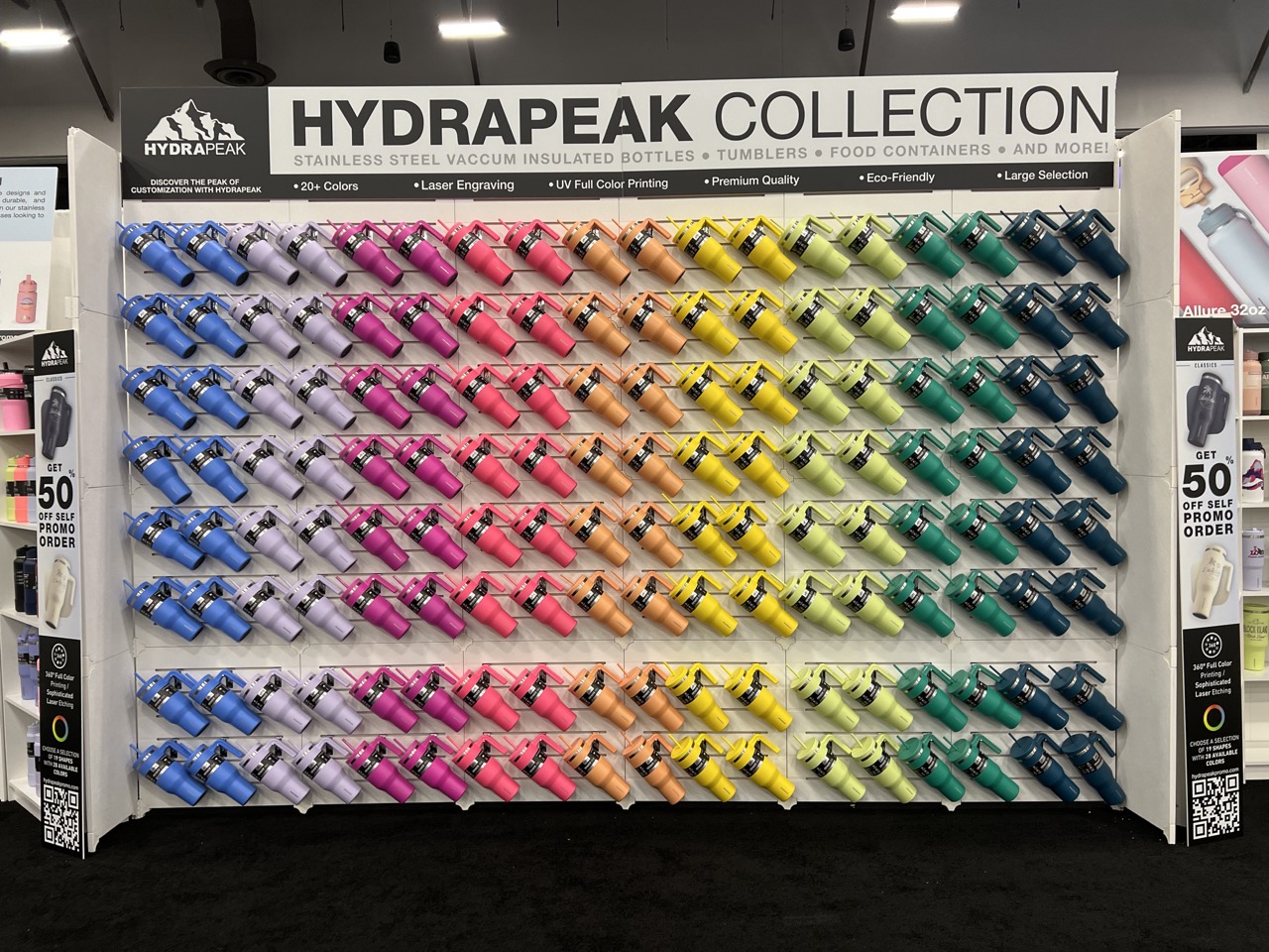
Like a neon light, flashes of color attract the eye. Using rainbow motifs or creating walls of color make it almost impossible to resist for a passer-by. It’s just pleasing to look at, so they’ll want to hang around for a second. Using complementary colors or shades that pop out without feeling gaudy or too vibrant can turn a booth experience into a work of art.
Go Big (When You Can)
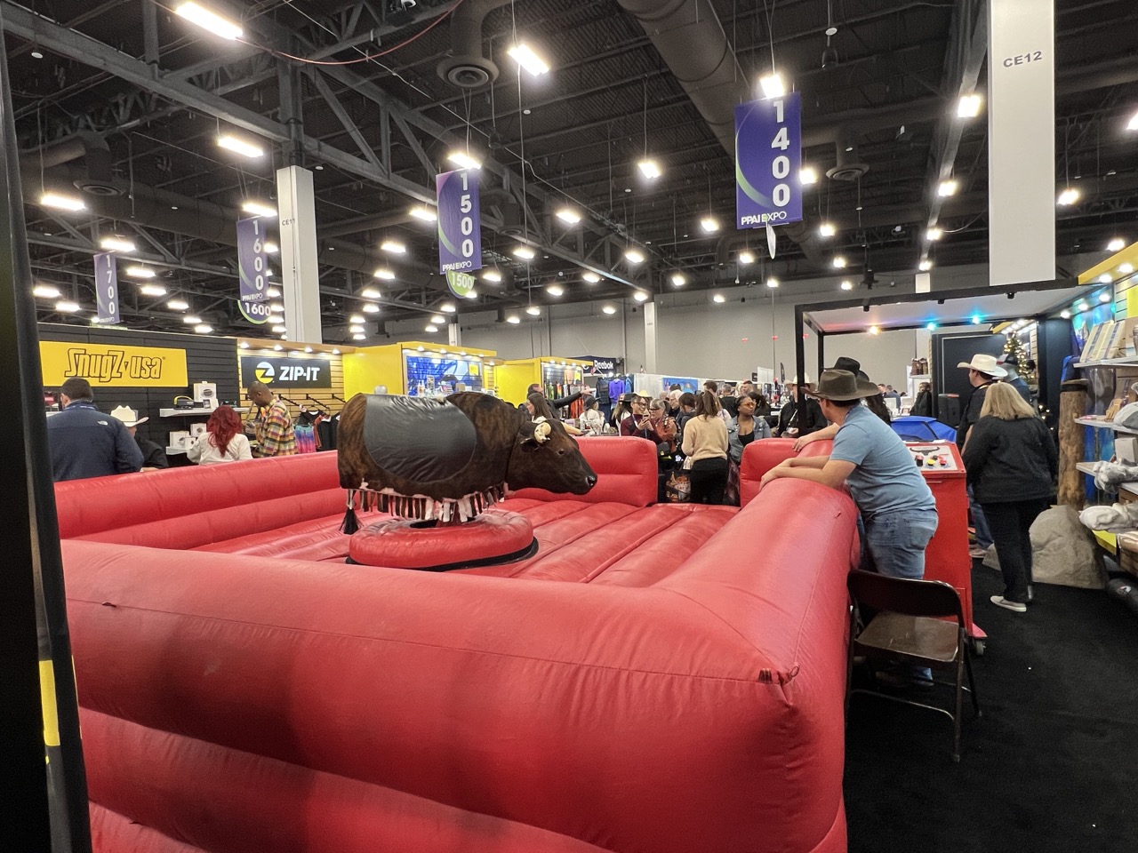
We all ventured west for the expo, so SnugZ USA gave us some classic cowboy action with a giant mechanical bull in their booth area. Now, this isn’t something that every company can do for their trade show booths. Space constraints are real (and injuries can happen). But, you can scale this down to the appropriate level for your clients. What this means is adding an experience and some way for people to participate. These can be simple games or any other interactive element.

