Getting kids to eat their vegetables is an age-old challenge for adults. Heck, sometimes convincing ourselves to eat our greens can take work.
That’s a problem one food producer is trying to tackle through branding and design. By tricking the customer’s brain into thinking a package of spinach is fast food, it might just be enough to accept or, dare we say, crave vegetables.
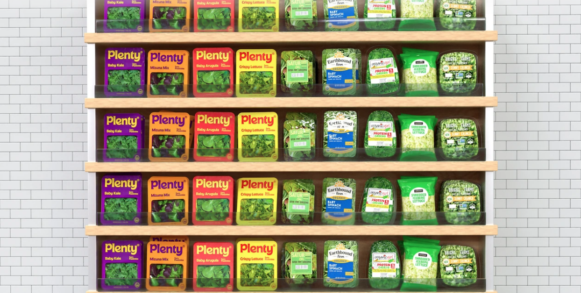
Plenty, a “vertical farming” company, is introducing a visual brand in partnership with design agency &Walsh, that uses color psychology to inspire hunger.

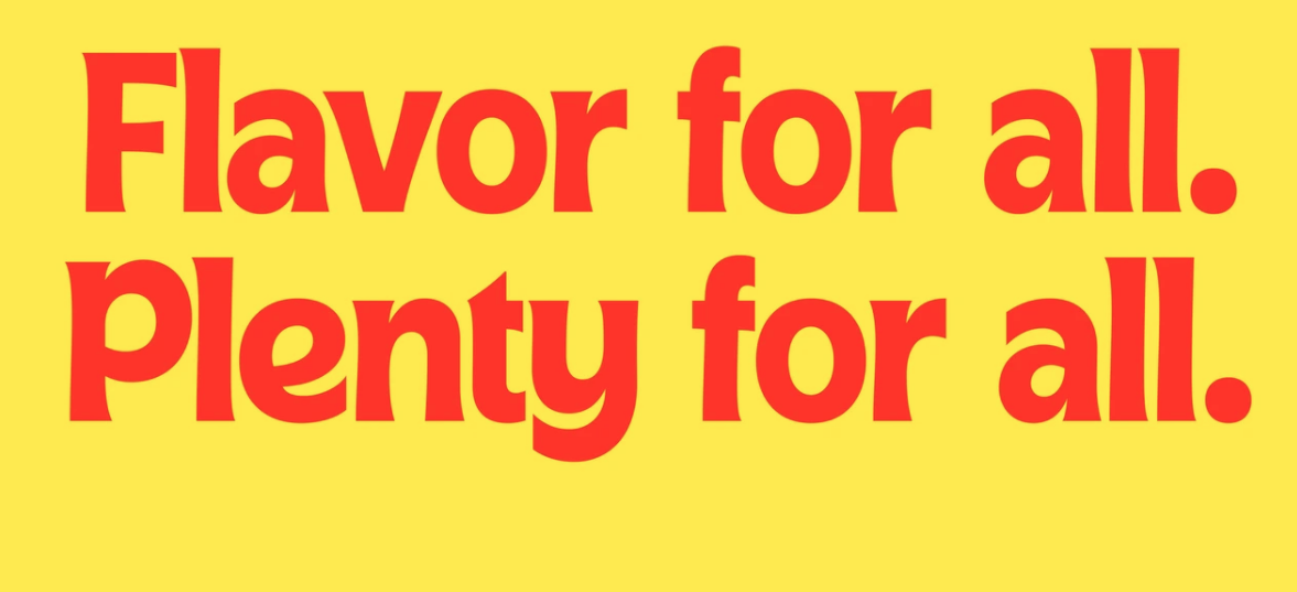
Using reds and yellows, as well as a custom typography that it believes customers will associate with flavor rather than health, the company believes it can borrow tricks from fast food packaging for healthier options.
Fast Company explained why red and yellow are so common in fast food imagery, such as at Burger King, McDonald’s, Wendy’s, In-N-Out, KFC and more.

Red inspires hunger. Yellow sparks happiness. McDonald’s wants you to feel both when you’re deciding whether or not to pull into the drive through or keep going.
Sure, the product inside is still spinach, but for Plenty, the work is over. You bought it.
“The goal for the rebrand was to make the packaging and brand feel more warm and accessible,” &Walsh founder and creative director Jessica Walsh said, according to Fast Company. “Almost all greens brands use a similar design aesthetic, so we aimed for the packaging to pop off of the shelf to pique people’s interest.”
Fast Company also drew a direct parallel to Burger King’s recent rebrand, which used rounded and curvy designs to appear more appetizing.
Packaging design is much more than just choosing a nice color scheme. There’s science behind it. The job is to illicit a direct response from the consumer (ideally a positive one). For a food brand, you want something that makes the brain crave your product. It turns out reds, yellows and curvy fonts get the stomach grumbling.
“Brands only have a matter of seconds to attract the consumer’s attention, especially in a crowded market segment like prepackaged salad,” says Cory Francer, editor in chief for Packaging Impressions, Promo Marketing’s sister publication. “Not only does Plenty do a great job here of graphical differentiation, but tapping into the shopper’s subconscious via packaging is a fascinating method of drawing that consumer in and enticing them to put the package in their cart.”


