Key Takeaways:
• Dual Trends in Drinkware Decoration: There are two main approaches to drinkware decoration – subtle, quiet branding and bold, full-wrap designs. Each caters to different client preferences and marketing strategies.
• Impact of Advanced Printing Technology: Advancements in printing technology have enabled more vibrant and complex designs, allowing for creative full-wrap decorations that can tell a story or make a product memorable.
• Growing Interest in Sustainability and Ceramics: There is an increasing demand for sustainable drinkware options and ceramic products. Clients are interested in the background and sustainability of the materials and decoration methods used.
When it comes to drinkware decoration these days, there are two distinct worlds. That’s what Tommy Gomez, account director at distributor Brilliant (asi/146116), believes.
“There’s the quiet branding, placement-wise – keeping it very subtle,” says Gomez, ASI Media’s 2023 Distributor Salesperson Up-and-Comer of the Year. “And then there are clients who are leaning more on the full wrap and creating a pattern with their logo.”
Drinkware suppliers have noted the same duality with extensive full-wrap designs or requests for imprints so small they’d take a keen eye to notice. With that in mind, PPM here explores some of the latest trends in drinkware decoration.
‘Billboard Branding’
It might be tough to think of a water bottle or coffee tumbler as a billboard – but that’s the comparison Heidi Urban, vice president of business development at drinkware-focused supplier Gordon Sinclair (asi/57800), draws.
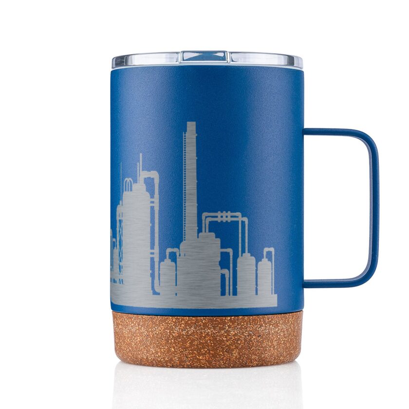
Forty-ounce Stanley tumblers and similar popular drinkware products certainly provide more surface area for branding than a small mug, for example, and drinkware has become nearly as much of an accessory as a purse in some cases. But more than anything, going big with decoration is a way to make a drinkware product memorable.
“These are marketing pieces that people are showing off,” says Jeremy Denson, president and co-owner of Texas-based supplier Bison Coolers (asi/40588), which also sells drinkware. “You want to have them pop and you want to stand out.”
It’s often a particular type of client that wants to take the so-called “billboard” approach to a drinkware product, says Mindy Hoffmann, global category director for technology, drinkware and gifts at Counselor Top 40 supplier PCNA (asi/66887). Some companies are just loud, she says – they want their logo anywhere and everywhere, and they aim to draw your eye by doing something exciting.
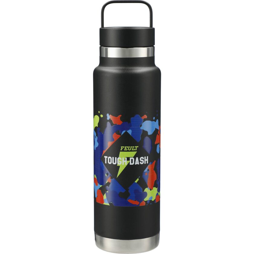
“Anyone who’s using stuff for social media would definitely be screaming their logo,” Urban adds. “If it’s going to be an Instagram or TikTok piece, then they want to make something flashy and hyper-colored. That will obviously grab attention.”
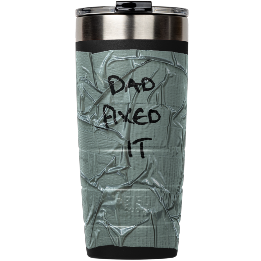
Sometimes, showing off design capabilities can lead to a sale of a drinkware item that incorporates more elaborate decoration techniques. At a trade show last year, Denson met with a client who was adamant that he wanted anything but drinkware. Denson acquiesced but handed him a tumbler with a textured full-wrap decoration made to look – and feel – like duct tape, a design from a Father’s Day launch themed around “Dad fixed it.” The client was so caught off guard by the unique design that drinkware became the focus of the meeting after all.
“It’s three-dimensional – it’s got touch and feel,” Denson says. “You can put together a product and show that to a customer and they’re like, ‘I’ve never seen anything like that before.’”
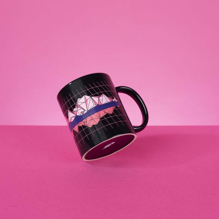
Going Full-Wrap
Taking the so-called “billboard” approach doesn’t necessarily mean just supersizing a logo on a new style of water bottle. Especially with ever-advancing printing technology that’s allowed for more vibrant digital printing and increasingly complex designs, there’s more room to play. Jolene Slama-Saenz of Diamondback Branding (asi/49546) cites tech that allows for 270-degree color printing on drinkware with handles, for example; this became especially necessary during the 40-ounce Stanley tumbler craze.
Sometimes, Gomez says, the logo can even take a backseat. Brilliant, for instance, recently fulfilled a mug order for investing company Robinhood that involved a bright full-wrap pattern around the circumference – but placed the Robinhood logo on the bottom of the product. It will still be visible whenever the end-user takes a sip, but it’s far from the focus.
The imprint can tell a story, rather than just provide a space for a logo. Decoration for an employee appreciation Earth Day product might feature a sprawling tree or another sustainability motif, with a small logo incorporated, Urban says. Or giveaways for an event in Chicago would place the Windy City skyline at the center of the design rather than the sponsor’s logo.
At Bison, Denson says that seasonal launches meant for retail – like an Edgar Allen Poe-themed Halloween print from the fall – also often translate over into promo, even if it wasn’t planned that way, because people are looking for something fun. The supplier incorporated the Hard Rock Cafe logo into that Edgar Allen Poe design, for example, for a big Halloween bash at the restaurant chain’s Oklahoma location.
A More Subtle Approach
On the complete opposite end of the spectrum are clients who want to let their chosen bottle speak for itself, especially if they’re paying for a top-line retail brand name, Gomez says.
“We either get a lower-end bottle and go ham on the decoration,” he says. “Or, we go with a high-end bottle and keep it very simple.”
The base of the bottle can provide a way to stand out without an elaborate design. Bison offers a wood grain-printed tumbler, for example, that feels like wood grain thanks to the added texture of a spot varnish.
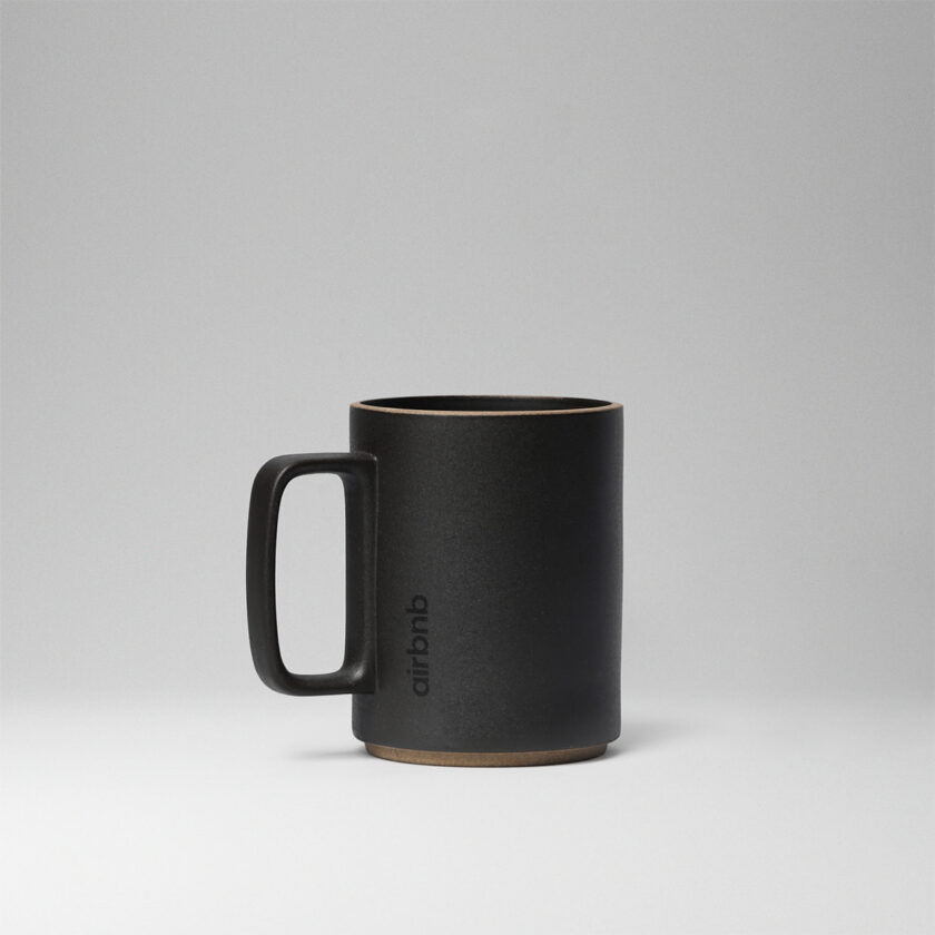
But client desires to leave the bottle alone can take “quiet branding” to a whole new level – with some dialing back their logo loudness so much that it’s barely there.
“Sometimes we have to tell customers, ‘It’s so small this may not print,’” says Urban.
It’s Urban’s more fashion-forward clients that often gravitate toward an understated decoration approach. Those are the companies that are most locked in on what’s trending in retail, including “in” colors. She says some dark corporate hues are growing in popularity again, which prompted Gordon Sinclair’s recent forest green product launch.
Ceramics & Sustainability
Slama-Saenz says she’s also seeing an increased interest in ceramic lines beyond classic mugs to other drinkware categories, like tumblers. At Bison, for example, more clients have been asking for ceramic-coated interiors, which can help mitigate the metallic taste that can come from stainless-steel drinkware, Denson says. He’s currently working on adding that option to the company’s entire lineup.
Gomez has noticed the same increased interest. He points to brands like Felt+Fat, a California-based company that can PMS color match stoneware. Again, this allows for more subtle branding without a logo.
supplier ETS Express (asi/51197) with a design focused on color rather than heavily logoed branding
And with a select group of clients, there’s also more emphasis on where the products are coming from.
“When it comes to stoneware, it’s less about the vessel itself having a logo on it and more about clients feeling like the ceramic has a story,” Gomez says. “Because when you think about it, ceramic mugs, like pottery, are inherently artisanal.”
Customer desire for product background information has similarly increased when it comes to sustainability, Urban says – not just drinkware made with recycled materials, which she’s certainly seen demand for, but also sustainability in decoration methods. Full-color printing, for example, uses the exact amount of ink needed without extra fumes or overspray.
“We’re finding,” Urban says, “that customers are now starting to ask those questions.”