Key Takeaways
• Domino’s first brand refresh in 13 years emphasizes packaging design as a core brand element, using cohesive graphics and complementary pieces to reinforce brand identity.
• New upscale black-and-gold boxes for premium items and brighter red-and-blue colors for standard packaging aim to create a sense of indulgence and stand out in a competitive market.
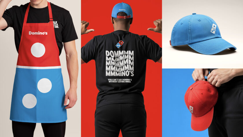
• The refresh extends beyond packaging to employee apparel, reinforcing a unified aesthetic and demonstrating that tactile brand elements remain crucial in the digital age.
Brands go through refreshes and renewals on a somewhat regular basis. It’s a way to create renewed interest in the brand among repeat and potential customers.
Domino’s, which is trying to appeal to customers despite economic factors creating a dip in dining out, just spruced up its aesthetic a little bit, and its packaging is at the front and center of it all.
In the digital age, some traditional paper products go by the wayside, but pizza, one of the most eternally beloved products in modern history, will always need a box. Therefore, the packaging (the graphic design, the different shapes, etc.) always plays a key role.
Domino’s’ pizza boxes are designed to complement one another. One piece makes up the red half of the logo, another the blue. That itself might make some perfectionist customers want to order two pies, knowing they’ll have the complete logo that way.
Condiments like Parmesan cheese and crushed red pepper also come in small packages that create the red and blue logo together. The designs for the sauce containers also got a bit of a refresh.
This was Domino’s first brand refresh in 13 years, and the goal for the company was to return to its roots and use its tactile pieces as the focal points.
“Over the past decade, we became known as a technology company that happens to sell pizza,” Kate Trumbull, executive vice president and global chief marketing officer for Domino’s, said in a press release. “But with our ‘Hungry for MORE’ strategy, we’re bringing the focus back to making and delivering the most delicious products and experience, which is what Domino’s customers really want.”
The standout touch is perhaps the new packaging that Domino’s introduced for “premium items” like stuffed-crust pizza that comes in an upscale black and gold box. It’s made to create the impression of an expensive-looking item for an affordable price. Domino’s described the design as “premium” and “indulgent,” abandoning the traditional brand coloring in favor of something that evokes a more upmarket vibe.
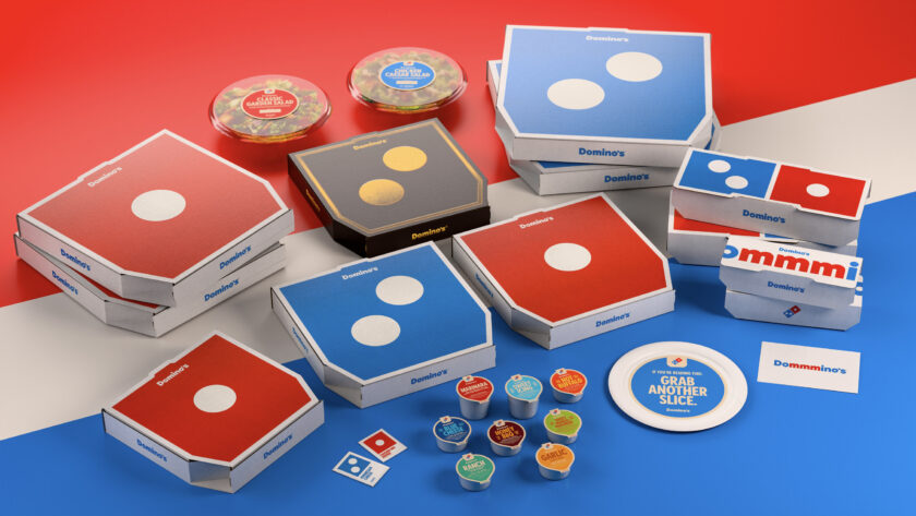
On other products, the blue and red were brightened to just pop a little more – a lesson for distributors and printers who incorporate packaging into their campaigns that the first impression is essential. If you can stand out from the competition, especially in an age where attention spans move so quickly and consumers have more options than ever, you’ve set yourself up for success.
For Domino’s, the box represents a lot more than just a thing to hold pizza or breadsticks. It’s the visual representation of the brand, an instant signifier that carries the history of Domino’s. It’s a good lesson in the fact that packaging should not be an afterthought, the same way an imprint on an apparel piece wouldn’t be an afterthought.
Speaking of apparel, Domino’s completed the new look by creating optional pieces for employees including hats (red and blue options, naturally), aprons and T-shirts. It’s a bit like when McDonald’s created interchangeable uniform pieces.
Domino’s uses different components to create a whole picture, attracts attention using thicker fonts and brighter colors, and uses clever design techniques like an elegant black and gold for an expensive look. It can inspire people to order maybe more than they would have otherwise simply on the strength of the look of the packaging.