The Koozie brand, especially in the promo industry, is about as iconic as it gets. It’s one of those brand names, like Velcro and Kleenex, that’s so synonymous with a specific product that it often gets used to describe similar products, regardless of the brand. (Eponyms, if you’re an English major.) It doesn’t get much bigger than that.
But even the best-known brands can use a refresh from time to time, and that’s the situation BIC Graphic, Clearwater, Fla., ran into with Koozie. The brand—famously started almost by accident in 1979, when a construction worker realized tubing insulation fit perfectly around his aluminum can—had changed hands a few times over the years, from Radio Cap Company to Norwood and then to BIC Graphic. And, more importantly, it had grown well beyond beverage insulators to include a wide variety of other products, like cooler bags and other insulated drinkware. Its logo and branding, though, hadn’t kept up.
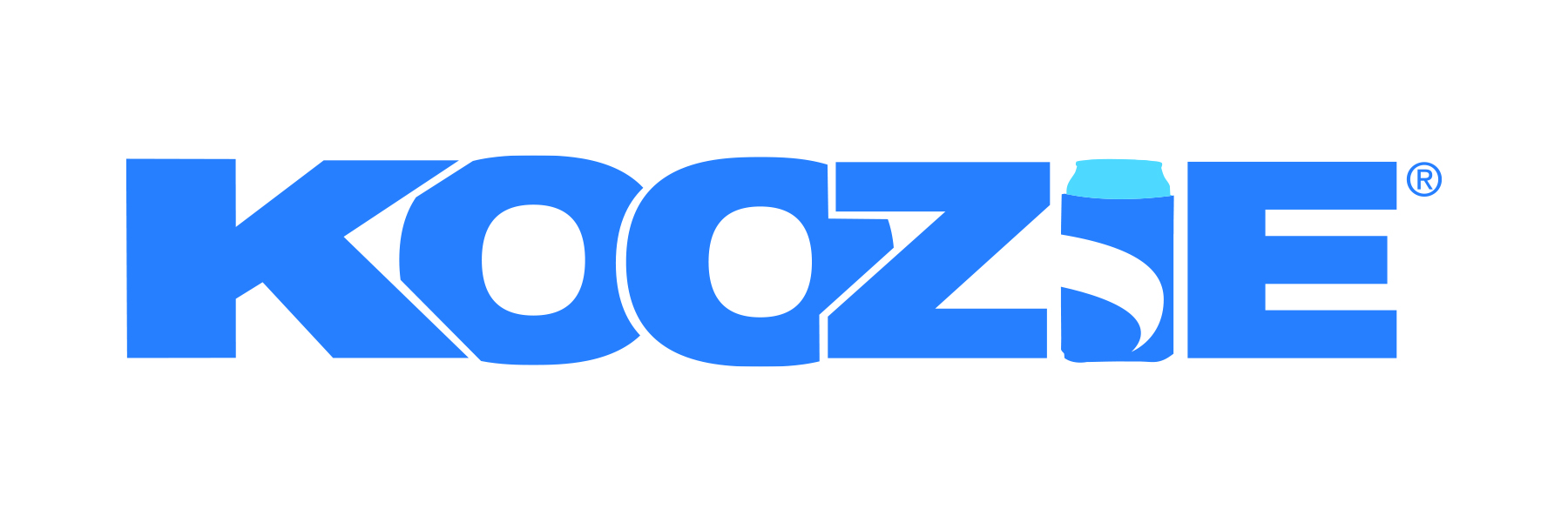
“The previous iteration of the Koozie logo was all upper case, with the letters overlapping like graffiti from the 1990s,” Elise Edgerton, senior channel development manager for BIC Graphic North America, told us. “It was not the best reflection of what the Koozie brand is today: friendly, genuine, dependable and easy-going. We also had technical issues with imprinting and molds due to the logo design configuration, so it was the perfect time for a logo refresh.”

BIC Graphic also saw a rebrand as an opportunity to further expand the Koozie brand into the outdoor category, as customer surveys showed many consumers already related it to outdoor activities. So BIC Graphic got to work.
The supplier’s in-house creative team would handle the rebrand, considering feedback from those consumer surveys at every step of the process. BIC Graphic assembled a team of creative designers, web designers, individuals with direct-to-consumer experience, industrial designers, communications managers and more. On a big board, the team posted examples of the brand persona, vision and mission, using that as a starting point for the logo redesign.
“The initial sessions were each on a specific topic, like reviewing the competitive landscape, fonts, ad styles, imagery, colors, voice and abstract concepts,” said Edgerton, who managed the project. “Our creative team presented options based on feedback from the previous week. Each time a design was presented, we went back to our brand DNA to see if it fit the newly refined identity. We presented options from these meetings to a larger internal group for their feedback. To help them visualize each option, we mocked up the logos on ads and products so people could really get a feel for the new designs. Based on that feedback, there were more revision phases and adjustments until we arrived at the final design.”

Edgerton said the team went through “tons and tons” of iterations and ideas. And it wasn’t always easy to get full buy-in. Some fans of the Koozie brand were attached to the old logo, while others were simply hesitant to make such a radical change. But the team managed to stay focused, always coming back to the objective and the Koozie brand identity.
The end result is a dramatic shift from the previous logo. Gone are the tightly packed capital block letters, replaced with stylized, easy-to-read lowercase text. (“Friendly and original,” Edgerton calls it.) The new splash design is dynamic and vibrant, with the four colors carefully chosen to symbolize various elements of the outdoor lifestyle. BIC Graphic’s design team even named the colors accordingly—orange, for example, is “Fun in the Sun,” while blue is “’79 Blue,” a nod to Koozie’s beginnings. And, in a subtle branding flourish, the splash uses negative space to create a “K” shape.
“The splash can also be used as a standalone icon,” Edgerton said. “We wanted to be sure the new logo included an icon that was memorable and could be used in different ways based on how you want to brand each item.”

One look at the new logo, and it’s clear the BIC Graphic team nailed it. The design is clean, modern and, above all, fun. It’s easier to work with. And it clearly communicates that sense of motion and outdoor action that the Koozie brand has come to embody. It’s a credit to Edgerton and her team, whose task—to transform an iconic brand in a way that stays true to its roots and honors its history—was no small one.
“Our ultimate goal was to have a logo that reflects the Koozie brand as a friendly outdoor brand that is more than just can coolers,” Edgerton said. “We’re confident that this new look conveys our messaging perfectly. I am grateful for the team that put this new logo together. Kudos to all the folks who worked hard on the Koozie brand refresh. I truly believe we have the best team of dedicated people in the industry.”
[content_widget id=”115049″ align=”left” width=”30″ widget_type=”post_factbox” full=”true”]


