Was your New Year’s Resolution to drink more water? Maybe drink less coffee? Heck, maybe it was to drink more coffee, but to make it at home. Regardless, drinkware tends to play a role in these types of resolutions more than you might think.
Starbucks, being one of the most recognizable beverage brands on the globe, is an influencer when it comes to drinkware design. Suppliers are also looking to companies like Stanley, Hydroflask, and YETI, but Starbucks’ use of color, theme, and branding can provide inspiration for promotional campaigns throughout the year.
As 2024 begins, Starbucks just released three new lines, lining up with the larger Winter season, the Lunar New Year, and Valentine’s Day, each with different beverage lines to match the overall aesthetic and vibes of the time of year.
Starting with the Winter collection, the first thing we notice is that the color palette is far from muted tones. Starbucks uses bright shades like a neon yellow and light purple; as well as a deep, bold teal and even earthier brown tones.
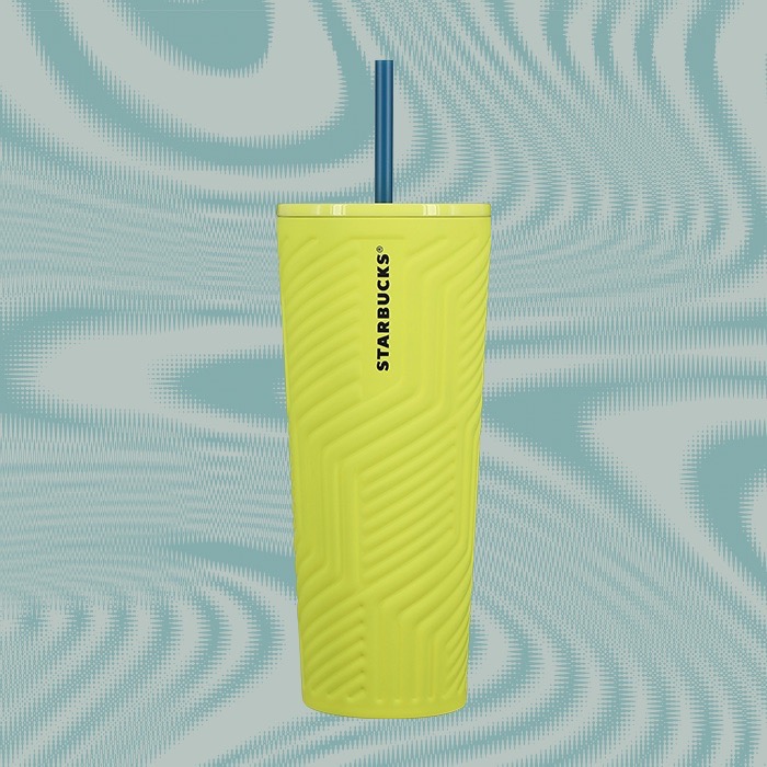
In terms of the branding, it uses embossing and 3-D designs to incorporate the famous Starbucks logo, and add texture to the bottles and tumblers.
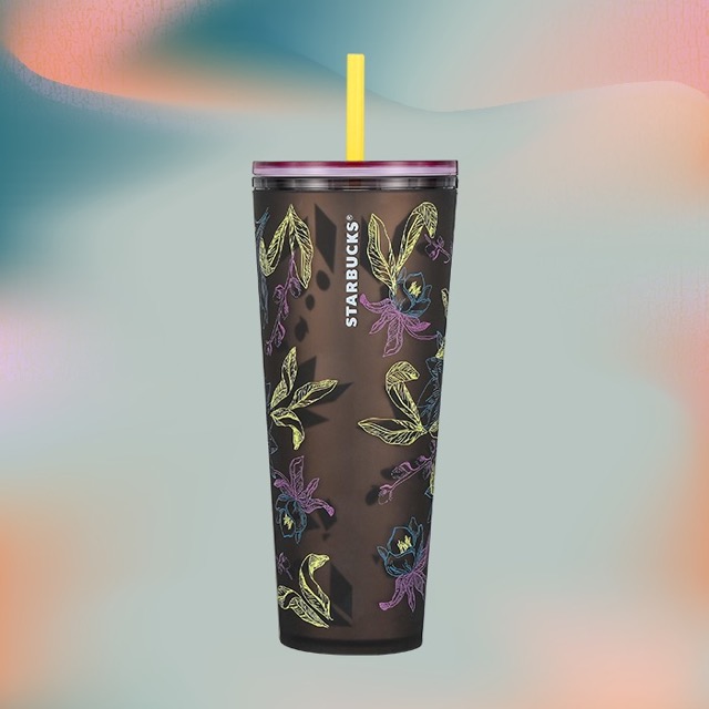
Up next is the Lunar New Year on Feb. 10, and to celebrate the Year of the Dragon, the collection uses a red and gold color scheme, but still relies heavily on texture.
There’s a coffee mug that features a scaly pattern all over, with the handle serving as the dragon’s tail, and a horned face peeking out on the front.
The scale pattern is also printed on a cold cup, and the bold red is shown on a tumbler.
Not big on Starbucks but I was born on a lunar year of the dragon! pic.twitter.com/e8wTawIITU
— RokstarGene유진 (@RokstarGene) January 3, 2024
It appears as though Starbucks has different releases across the world, too. A Twitter account from Thailand posted a picture of a collection that included a “walking” coffee mug, and drinkware options that skew more pastel pink and blue than red and gold.
เตรียมช้อปคอลเลคชันใหม่ Starbucks Thailand Year of The Dragon พร้อมเป็นเจ้าของแก้วและทัมเบลอร์ลายมังกรสีสันสุดคิ้วท์ได้ที่ร้านสตาร์บัคส์ ตั้งแต่ 8 ม.ค. 67 เป็นต้นไปนะคะ ✨🎉
📍 ร้าน Starbucks ชั้น 1 The Mercury Ville @ Chidlom#TheMercuryVille #MCVChidlom #Starbucksthailand pic.twitter.com/fRBa7guj6q
— The Mercury Ville @ Chidlom (@themercuryville) January 8, 2024
Finally, with Valentine’s Day surprisingly close (very surprisingly, to all of us in relationships), Starbucks is prepping with a line that uses little accessories like heart-shaped straw toppers. Of course there is still the heart motif you’d expect for Valentine’s Day, but the American release one again uses that bold teal, as well as the light purple, rather than the stereotypical bright pink or red.
https://twitter.com/hkeen327/status/1745116478909686106
There’s also a full line of color-changing cups with various designs.
So, what do you as a distributor use with this information? Well, let’s boil it down to a few key takeaways:
1. Use color in different ways. You can incorporate the brand’s traditional colors, sure. But, when you’re tying in with a holiday or time of year, think beyond what you might expect. How else can you capture the essence of the holiday or celebration through color and stand out from the competition?
2. Use different printing methods. Adding texture or three-dimensional elements to drinkware, printed products, apparel, or any other promotional product literally adds a new dimension to the experience. Think about how the brand’s name or logo can exist in that space.
3. Drinkware is popular year-round. While some products have a “season,” there is always a time for dinkware. Water bottles will always get used. People drink hot coffee in the summer and cold brew on frigid winter days. Just be smart about how you’re using your drinkware in a promotion, rather than just lazily throwing a simple item at a customer and expecting them to see the value in it.


