As 2018 nears its end, people are starting to craft their resolutions for 2019. Some people might want to exercise more. Some people might want to budget a little better. What Pantone thinks everyone should do is just chill out a little bit, and their 2019 Color of the Year choice is designed to help us do just that.
We give you Pantone 16-1546, better known as Living Coral:
Did you know that the @pantone #ColorOfTheYear 2019 is #LivingCoral! 🍑 | @pantone will be hosting a special #fontsunday on the Design Museum's Twitter feed to mark the announcement this week. Stay tuned for more information. pic.twitter.com/mHvPC9Ibm9
— the Design Museum (@DesignMuseum) December 6, 2018
It’s nice, right? Gives you that sense of calm and serenity? That’s the goal! We’ve successfully social media’d and politics’ed ourselves into a cyclone of stress all year, so Pantone wants 2019 to be a bit more mellow. Via the company’s announcement:
In reaction to the onslaught of digital technology and social media increasingly embedding into daily life, we are seeking authentic and immersive experiences that enable connection and intimacy. Sociable and spirited, the engaging nature of Pantone 16-1546 Living Coral welcomes and encourages lighthearted activity. Symbolizing our innate need for optimism and joyful pursuits, Pantone 16-1546 Living Coral embodies our desire for playful expression. Representing the fusion of modern life, Pantone Living Coral is a nurturing color that appears in our natural surroundings and at the same time, displays a lively presence within social media.
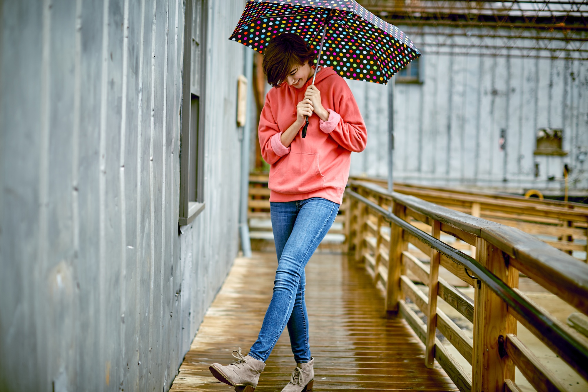
Something designed to be comforting and easy on the eyes is pretty much made for apparel, then. Heck, some suppliers, like Hanesbrands Inc., already offer some apparel items in the color:

“With everything that’s going on today, we’re looking for those humanizing qualities, because we’re seeing online life dehumanizing a lot of things,” Laurie Pressman, Pantone Color Institute vice president, told the Associated Press. “We’re looking toward those colors that bring nourishment and the comfort and familiarity that makes us feel good.”
Basically, we’re all running around, constantly overstimulating ourselves with screens and multiple lives that we need to force ourselves to take a breather and tell ourselves to calm down.
The Pantone Color of the Year is always indicative of the current climate in the world. Last year Pantone tried to go bold with Ultra Violet. The year before that it was Greenery, symbolizing rebirth and natural beauty.
As an eventful year comes to a close, we’re hoping this particular shade can help us find a bit of serenity. Serenity now!
“Color is an equalizing lens through which we experience our natural and digital realities, and this is particularly true for Living Coral,” Pantone executive director Leatrice Eiseman told NPR. “With consumers craving human interaction and social connection, the humanizing and heartening qualities displayed by the convivial Pantone Living Coral hit a responsive chord.”


