This article originally ran in Apparelist. To read more, click here.
For those in the fashion industry, a category that definitely includes garment decorators, the Pantone color forecasts can be a very useful tool. If you are not aware, Pantone selects, each autumn, a color to represent the upcoming year, a color that it feels captures the feelings or emotions that the year to come will embody.
Pantone also creates color forecasts for each fashion season, usually offering a spring/summer forecast and then a fall/winter forecast. These forecasts reflect the colors seen on worldwide fashion runways and in designer collections, and showcase colors that may become popular in local stores or among your customers. So what does this mean for apparel decorators specifically?
Pantone’s Color-Matching Systems
First, a little lesson on Pantone. Pantone has two color-matching systems. They are the Pantone Matching System (PMS) and the Pantone Fashion, Home and Interiors (FHI) System. Most people are probably familiar with the PMS system since that is commonly used when matching ink and thread colors. The FHI system may be less familiar.
Pantone offers dual systems for two reasons. One, each system is designed to meet the needs of those who will use it. People working in fashion and clothing need more neutral colors. Print and packaging designers need colors that will attract attention and pop on a shelf.
The second reason is that the appearance of a color can change based on the material on which it is used. Using the relevant system helps ensure that the colors included can be reproduced on the relevant materials.
The Fashion Home and Interiors system uses two codes. “TCX” refers to textiles, while “TPG” refers to pigments and coating. This is in contrast to the more familiar PMS used by the graphics system. To learn more about the Pantone color system for textiles, visit this link.
Pay Attention to Pantone Color Palettes
For Spring 2024 Pantone says that the color palette is an “eclectic mix of vibrant hues, nature-inspired tones, and reliable core heritage shades.” Although the color forecast varies slightly depending on where you are in the world, the overarching theme, according to Pantone, is “multi-faceted colors that speak to our desire for personal authenticity and meaningful expression.” It’s a lot of fancy words, but what does it all really mean in practice? Let’s take a look at reports from two Fashion Weeks, New York and London, to find out.
The New York Spring 2024 palette contains some moody darks, some vibrant lights, and a selection of basic foundational colors on which a mood can be built. For the darks, we’ve got:
- Roobios Tea, “a full-bodied red imbued with rich woody notes”
- Watercress, a dark sage green
- Marlin, a dark blue with traces of slate
- In the darker category, there’s also Mint, which is a version of emerald green.
The lighter and pastel colors include:
- Desert Flower, which is a peachy pink
- Chambray Blue, which is a brightened denim blue
- Pastel Lilac, which, as the name implies, is a “soft and powdery lavender hue”
- There is also a bright yellow called Lemon Drop and a turquoise blue called Capri.
And, finally, there are the foundation colors:
- Brilliant White
- Mushroom – an “earth rendered taupe”
- Northern Droplet – a light gray
- Quiet Shade – a dark, almost black gray
- Brush – a khaki hue
In London, the palette for Spring 2024 contains fewer pastels and in-your-face colors.
The palette is still pleasing, but a bit more muted. The London palette includes:
- Horizon Blue, a darker turquoise hue
- Strong Blue, your basic blue but on the darker side
- Bistro Green, a “hearty, deep green tone”
Spicy Mustard and Sun Orange bring a darker yellow and orange, respectively, to the palette; and Chutney rounds things out by bringing an earthy brown tone shading toward red. For a real red, the palette offers Fiesta. Charlock offers a yellow shading a bit toward green, Burnished Lilac is a lighter purple shading a bit toward brown or gray, and Tarragon is a sage green hue.
As with the New York palette, the London palette has foundational colors on which the rest can build. In London, the foundations are:
- Moth, a “camouflage greige”
- Deep Well, which is your basic black
- Brilliant White
- Boulevard, a very dark gray
- Blue Fox, a “smooth and sleek cool blue gray”
One of the things we can learn from contrasting the New York Fashion Week forecast with the London Fashion Week forecast is that color trends vary depending on where you are in the world or even where you are in a state. So, while the Pantone forecasts are helpful places to start, it always pays to be alert to local trends.
When you go out, take note of what colors commonly show up on those you see around you. What are local school colors, or what are the colors for institutes of higher learning in your area? Being aware of local color trends can help ensure that you have the colors customers are going to want when they bring business to your shop.
The Influence of Pantone’s Color of the Year
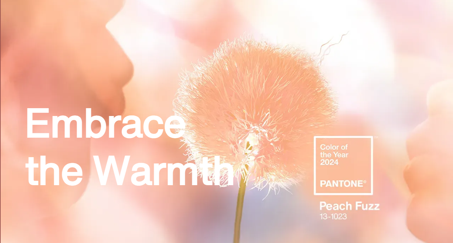
Finally, we can’t forget the color of the year. Each year, Pantone selects a color which they believe will reflect the attitude of the year to come. For 2024, that color is Peach Fuzz.
Pantone describes the color as a “velvety gentle peach tone whose all-embracing spirit enriches mind, body and soul.” Leatrice Eiseman, the executive director of the Pantone Institute, says of the color, “In seeking a hue that echoes our innate yearning for closeness and connection, we chose a color radiant with warmth and modern elegance. A shade that resonates with compassion, offers a tactile embrace, and effortlessly bridges the youthful with the timeless.”
The Pantone Color of the Year program began in 1999 and was created to engage designers and color enthusiasts around the world in a conversation around color. A team of global color experts travel the world looking for new color influences as well as cultural trends. All of this data is taken into account when the color of the year is selected. From the very first Pantone Color of the Year, Cerulean Blue, in 1999, the program has grown, and the selection of the color of the year now influences product development and purchase decisions in nearly every country and industry.