Key Takeaways
• Consistent color starts with process control. Printers should profile and calibrate every piece of equipment to a common standard.
• Substrates matter just as much as presses. Materials absorb and display ink differently, making substrate-specific color profiles essential.
• Dedicated color-management professionals can reduce reprints, minimize waste and improve customer satisfaction.
Whether you’re printing a retail sign, a postcard, a billboard or a promotional item, one thing remains the same: Color is critical.
Brands today aren’t willing to settle for anything less than a visually perfect match. They want the posters to match the direct mail, signage, retail displays and the promo items. Netflix red, Pepsi blue, UPS brown – these are iconic colors that help shape a brand identity. But even smaller companies and brands don’t want to dilute their message with colors that don’t look quite right and make a consumer question if the product or message is genuine.
Getting great color doesn’t have to be a mystery or require complex rituals to some pagan goddess of print. Instead, these five tips can help you get better color across the board, leading to better consistency, fewer reprints and happier customers.
1. Profile Everything
The first tip to getting great color is to know what you’re working with. Every operation that produces consistently great color on everything it touches has taken the time to profile their equipment. They know exactly what the wide-format press, the screen press, the flexo press, the offset press, even the inkjet proofing press are capable of when it comes to color. They know which presses tend to skew a bit blue, which consistently has warmer tones out of the box and which always wants to add a red cast.
2. Calibrate
Once you’ve profiled everything and know where the presses stand, take the time to calibrate. And not independently – every press should be calibrated to a single standard across the board, such as G7+, which gets every piece of equipment to the same neutral white balance point, ensuring prints will have a similar visual appearance.
3. Get Certified
It’s not enough to go through the motions once or twice and call color good. Great color management requires someone be constantly checking to ensure nothing has drifted out of the tight calibration you set. There are a lot of great certification programs out there – G7+ via the PRINTING United Alliance iLEARNING+ platform is certainly one of them and applicable to every print technology. But whichever certification program you choose, designate one or two production people who are passionate about color to become your operation’s certified color expert. And if you’re really feeling feisty, have them then go through the process to have your entire operation certified, as many of today’s top brands want to work with printers that have gone through the steps to guarantee color accuracy.
4. Don’t Overlook the Substrates
Remember that step above, to calibrate the equipment? Now it’s time to do that for every single substrate or object you print on. Paper, baseballs, pens, hats, metal, plastic – it doesn’t matter what surface you’re putting ink on, take the time to profile it. Every surface will take ink a bit differently, and the underlying color will impact the final results. Modern RIP technologies allow for substrate-specific profiles, allowing operators to select what’s running for that job and have the press automatically make adjustments based on the profile the color expert created. Taking the time to profile both the top substrates you stock, as well as any specialty items before they run for the first time, will save a lot of time, money and tears from shifted colors and unhappy clients.
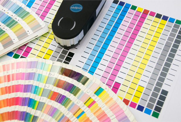
5. Invest in the Right Color Tools
Finally, if you truly want great color, it’s worth investing in a few critical tools. Have a spectrophotometer on the floor. If you can manage it, have a large one for calibrations, as well as a handheld version for spot color checks and to more easily verify color on non-flat objects.
Second, invest in a great light booth. No two lights are the same, and the same object will appear to have different color when it’s under fluorescent lighting, daylight, LED, etc. Use a dedicated light booth to create a “master” color check. Your light booth shouldn’t be just sitting in the middle of the floor with the facility lighting muddying the proverbial waters; at the very least, ensure it has a top and sides to help isolate the light. The light booth allows you to verify that all pieces in a run or campaign match under ideal lighting. Most of today’s light booths also allow you to view a print under different lighting conditions, so you can see how it will look in your customer’s ultimate destination and make any adjustments before a full print run.
Getting great color consistently isn’t magic. It just requires some time up front and investment in the right tools and knowledge. A color expert armed with a spectrophotometer and a good light booth can pay for themselves over time as you have fewer reruns, fewer make-goods, fewer angry customers, and far less wasted time and materials.